

Photo-story Evaluation
Below is my photo-book, this post is all about reflecting on the process that I’ve been through to get to my finished product.
What Went Well:
- Ideas
 I feel that I came up with some very strong ideas. There we’re some standout ideas like the Bus Routes, Billingsgate Market, Camden and Embassies. However ultimately the strongest idea was the the recreation of the First World War.
When I was first to pitch the idea, I thought my fellow peers and Celine would view it as a cop out, being a photo-story I could create at home. However Celine and my Peers really liked the idea. They felt it was a unique idea which no one else was doing. I felt that photo-stories are something you have to rely on happening. I was wondering if I could create a photo-story. This story was the perfect way to put this into practice. I’ve felt strongly about this idea because 2018 is hundreds years since the end of World War One. So we’re running out of time to make people aware of this massive war.
- Storyline
 I’m very happy with my choice in story line as well. As passionate as I was about this project. The hardest thing was choosing an event. WW1 has loads of well known battles, Tannenburg, Gallipoli, Verdun, Somme, Passchendaele, Caporetto, Arras, Kaiserschlacht, Vittorio Venato, Argonne Forest however they storylines would essentially be the same. Attackers advance, defenders retreat/fight back. So I want to go for a narrower story, one idea I did have the famous Lost Battalion which was a famous few days in the Argonne Offensive. This however would’ve been too tough to show through photography.
 I settled on the Christmas truce, this was a great choice because there was hundreds of battles but there was only one truce. It’s something which is unique and completely unexpected from war.
- Image Layouts
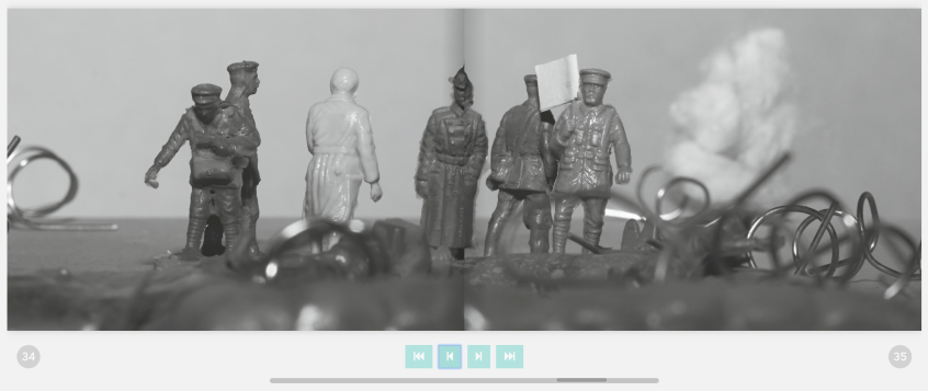
My book consists of three double page spreads. These are the pivotal moments of the story. They are the German surrendering, the soldiers meeting in the middle and the artillery restarting the war. Hopefully this portrays the real beginning, middle and end of the story. Said images work really well in the DPS landscape format.
- Time Management
I feel I was on top of my time management for this project. I’d shot everything by the 4th/5th week so I had a decent amount of time to focus on the layout and design of my book. I do however feel I could’ve done even better though.
- Design
 I’m happy with the design phase of my book. I’m glad that I decided to hand-draw a trench illustration to put onto my book. I went through several avenues of experimentation to implement this into my book. I was initially going to have it on every page but my peers felt they detracted from the images, which I was suspicious of and my friends seeing it all but confirmed it. I’m happy with how I portrayed it on my introduction and ending pages. The trenches is the starting point, where the soldiers we’re safe. The writing is in ‘no mans land’ where it was felt they we’re vulnerable. But no mans land in where the soldiers met for the truce.
- Importance Of Type
 In this project I learnt about the importance of type. I came into this project thinking that big wide fonts were the best for titles. However it’s actually much smaller font sizes that stand out more. We have to remember that the best way our eyes read is in small sections. Thats why newspaper type is so small. My type, like the trenches. Went through several avenues of experimentation before I reached the final product.
- More Use To Editing
 This project was not fully an exercise into how to take photos. This is was more of an exercise in how to arrange photo to tell a narrative. For this project I did loads of edits on tables.
There really is no better way to assemble a photo-book than actually getting the prints on the table and by moving them around.
It’s easier to draw comparisons and see a narrative form.
I didn’t essentially need this to create the narrative because that was all done when I was moving and shooting the figures. However it helped to find repetitive images and work out which images work together or on their own.
Even Better If
- More time for Design
I mentioned earlier that I was on top of my time management. I do however think at the same time my management of it could’ve been ever better. I didn’t spend as much time as I wanted to in the research for my design. I had plans to try and take inspiration from diaries from the First World War. I felt this could add an extra layer to my book. However I never really had a chance to star
- More Time for Delivery
Next time, I’d leave more time for delivery. My book arrived on Tuesday the 5th which is two days before the deadline. I’m not saying earlier order would’ve given me more time to make corrections, but it would’ve allowed more time for delays in delivery. This nearly proved disastrous though.
- More Time for Delivery Part 2
 My book arrived on Tuesday the 5th of June. When I opened the package there was instantly a problem. My book had been sent to me however the pages had been binded to a front cover for an Automative photographer called Adam Hill. I instantly rung Mixam and arranged for a replacement one to be delivered to me. I’d spoken to Celine and she was happy to submit the delivered book on Thursday and replace it with an updated one when it arrived. To which the updated one arrived on Thursday morning.
- Bleed marks
When I got the printed book back, the only other problem [apart from the incorrect cover] was that some of the pages in the 2nd half of the book you could see white where the bleed was. This was a mistake on my part, I should’ve made the bleed the same colour as the page.
- More arts and crafty

Next time I’d definitely like to make my own book. The book binding workshop with Celine definitely made me consider the possibility of making my own book. Maybe if I did the workshop at OffPrint I might’ve reconsidered.
 I’ve just received my photo-book from Mixam and I am absolutely GUTTED!!!
 Apart from that I’m very impressed with the book. I really like the images especially the double page spreads. Espeically the one where the soldiers are shaking hands, there hands meet in the bind, which I intended.
 Below is the final layout of my photo-story A World Beyond The War. I’ve ordered the book from Mixam. In A4 with 130 gsm silk paper.
 Thursday was the day for my latest tutorial for Location Photography. Celine started the by showing us a catalogue of books that MACK did. It was shown to make a point, which Celine said wasn’t valid for my idea because my book works with it. However Celine was showing us that not many photo-books are made in Landscape. In the Mack Publisher catalogue there was only one landscape book. Landscape is a very tough format to use, not only does it squash portrait images it’s very tough to use a Double page spread effectively thanks to it being turned into a panorama. This is something that was perfect for my photos but for other photos it isn’t good.
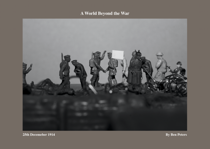 So we started by looking at my updated photo-book layout. Celine liked the improvements I made to the trenches. There now grey rather than a harsh black and there only on the end paper where the intro and outro are. This way the images can talk for themselves. Celine believed that I need to pay more attention to type. My intro and outro originally had lines that stretched across the entire page. After some thought I’ve decided to change this to a 1/3 of the page. It’s just too tough to read a line that goes across an entire width of a page, especially for an A4 landscape book. Celine also said that I’ve clearly realised that smaller type is better than bigger type. Case in point the front cover. I had the name A World Beyond The War stretching across the cover. Now I’ve changed it to Font size 12 and it is now much easier to read and take in.


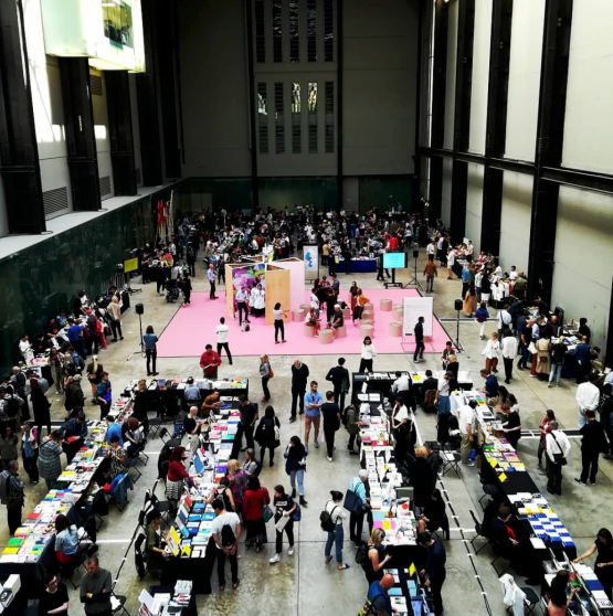 Today I went to Tate Modern to visit the Offprint event. Not only was this recommended by Celine but my secondary school photography teacher Jon Nicholls was on the Photopedagogy stand.
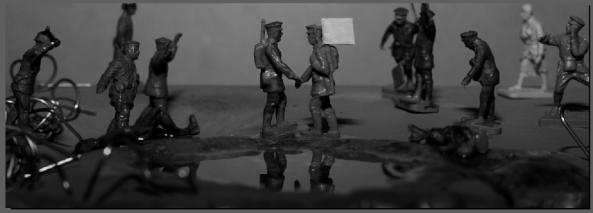 Celine agreed with the layout of my book. It was felt that I had one of the few photo-books that works well in landscape. It really compliments the double-page spreads of the pivotal images. It really throws the focus onto why the images are pivotal, for example the two soldiers shaking hands.
 The next thing I posed was the trenches I drew to put into my book. I liked the idea but I had one problem with them. We’re they distracting. Which Celine said they are prominent but so are the images. Gemma felt that i should change the colour, I shouldn’t use such a harsh black. Gemma suggested using a grey, maybe a grey that appears in the image. Are much discussion we came to the conclusion that I shouldn’t include them on the pages because they we’re simply too distracting for the images. Celine however did think that I should use them on the end pages. Which is what I’m planning to do, subject to changing the colour.
 Celine recommended coming with an updated design to the next tutorial and then print it after that tutorial. I am however keeping my eyes on both Mixam and Blurb for how long it will take to produce and send. Mixam is currently listed as Tuesday the 29th for delivery which the following week has a bank holiday Monday so thats a further day. I might have to end up printing the tutorial.
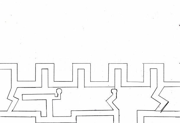 Here are the results of the trenches I intended to draw into my book. I like it but it doesn’t feel as strong as I thought it would. Maybe I’ve got the scale of the trenches wrong. I might do another sketch tomorrow.
 This is how I initially intended to put the drawing into my book. I did initially do the trenches in white but they just looked very distracting so I did the trenches in black. Where they felt better but still not what I expected. I messaged Ryan asking him his opinion. To which he said “I’d tone it down a bit … but the idea works” I’m going to ask my group in my tutorial what they think of the idea. Does it add, or does it detract from the images.
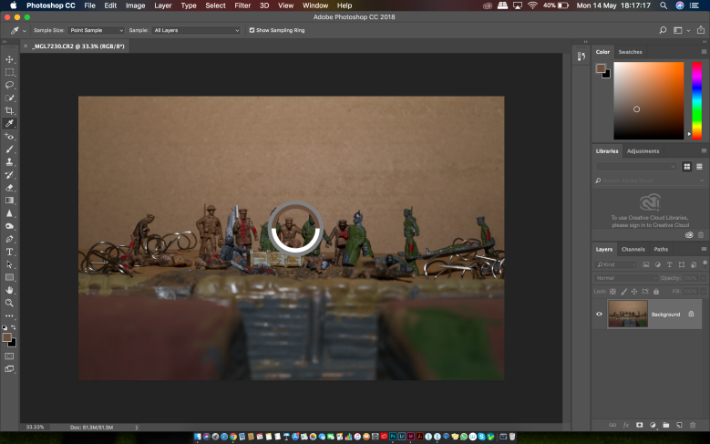 I’ve made inroads into the design of my photo-book. I’ve decided that the page should be a brown colour, to represent the mud of the trenches but also the colour of the British uniforms. I did this by opening one of my RAW files in Photoshop and using the Eye-drop tool to select the colour of the British uniform. The I copied the colour into InDesign. However my selection was a tad dark so I used the eye-drop tool again to pick a lighter colour.
 After this I was thinking how can I take the design further, how can I make this feel even more like WW1. I’m going to try and draw a trench system. This will be like the typical trench system. The front line where the trenches constantly zigzag, then theres the reserve trenches which were usually straighter with the odd zigzag. These we’re joined by communication trenches.
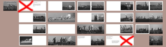
 Now that I looked at the binded version I’ve realised that I need to make adjustments to a few image, this one in particular where the soldier in the middle is lost in the bind.
 I’m thinking of using Mixam for my book, on the left is the quote that I got for two copies for the book. I’ve taken note that I have to take production and delivery into account, minimum four production days and two day delivery. So I’m hoping to order my final design next week.
 Final thing to mention, I’ve had a few thoughts about the name. I’m heading towards A World Beyond the War. I feel it’s a good name to symbolise the occasion where humanity over-powered the will to kill.