

Recent visit to London Rowing Club
 On Tuesday I went back to the London Rowing Club in Putney. This was just for me to discuss my idea with the people at the club. I decided to take my Canon 5D Mk.IV with me because I thought I could at least get the photography aspect done however in hindsight, I should’ve taken my tripod with me because I could’ve done my video there.
 This is because my idea really underwent a radical change, my idea is now focusing more on the London Rowing Club itself. There are three rooms including a gym inside the club that are full of images and paintings from times gone by, names of winners are all over the walls. It a place rich with history. So thats what my PA campaign is going to be about.
The video is going to start and end on the Thames. This is also where the Boat Race starts so hopefully I can show this when I shoot the video tomorrow.
 I managed to shoot the photography aspect yesterday, to which I think I’m going to reshoot the image of the frames but the image of the shell on the ceiling and the one of the rowers on the Thames are set to be used. The latter needs some retouching as the rower has got Dulwich Rowing on her jacket. I might try to remove the boats as they are distracting but this might be too tough.
I might reshoot the image of the frames because the depth of field is too shallow, I had to shoot hand-held and even at F2.8, I had to shoot a 1/60s. I’d really need an aperture of F7.1 to get the coat of arms and the text in focus, so if I use my tripod, I can have a longer shutter speed to let in the ambient light. The shot of the shell on the roof is 3.2-second exposure at F10. This was done to because it was on the ceiling, so it was mostly in shade and I wanted to capture the interior in camera. So what I did was put my camera on the floor with the 24mm prime lens and use the Canon 5D Mk.IV Wi-Fi to pick the focus and control the settings. So I could get the composition right and then shoot some frames and get the settings right, without having to move the camera.

 Geraint even gave me an insight into the history of the Poppy Legion. It was initially called the Haig fund. Which was founded by the British Field Marshal Douglas Haig who was the commander of the both the Battle of the Somme and of Passchendaele. American General John ‘Black Jack’ Pershing remarked that Haig was the “man that won the war” whereas British opinion was more divided. He received heavy criticism for sending attack after attack at Yrpes refusing to admit failure despite the heavy casulaites, something he did the previous year at the Somme and this the origin of his nickname, ‘The Butcher Of The Somme’. So maybe this fund was seen as a way of him giving back. This would go on to be the Poppy Legion. His reputation is probably the reason why the name Haig Fund was removed from the poppy.
 He also said that he feels the campaign should be even more direct. Like the Lord Kitchener campaign that caught the eyes of the viewer and sent thousands of young Britons to an early grave. He felt this could still be done with the silhouette. This could be achieved by having another snoot firing into one of the eyes. This would help to lead our eyes around the frame even more, like the golden ratio. We read left to right, so the type will draw us towards his eye and then our eyes will hopefully come down to the Poppy.
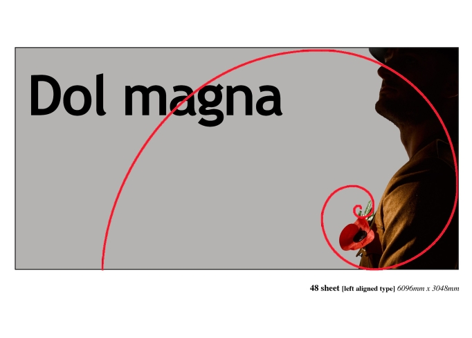
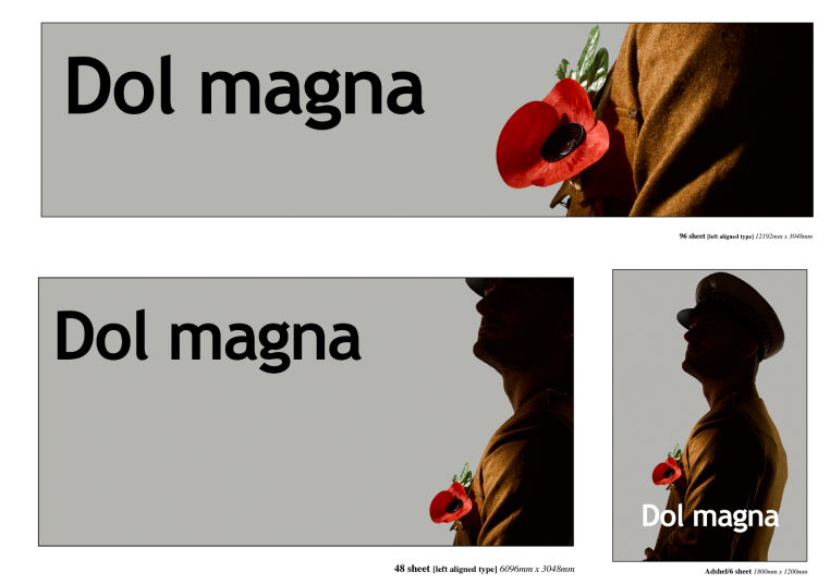 The talk with Geraint also led to me giving serious consideration into the size of the posters. We need to remember that the 96 sheet, needs to be readable in a second. It needs to have as little information as possible to tell the story so Geraint envisioned having the Poppy large and vibrant with a hint of the military uniform.
 Each time I look at my Poppy Legion idea I keep thinking of the images that were taken by Lt. Ernest Brooks on the Western Front. Particularly those which would go on to be known by the British public as the Anonymous Heroes of the First World War. These were a handful of images that he is most known for. When I think of World War One photography I think of his strong silhouettes of British Army soliders marching to or over no mans lands, silhouetted by the sky. It gave a massive sense of anonymity. I truly make you consider the lives of those who have been killed and that is what I want my poppy campaign to be all about.
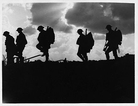

 Below is my final estimate for the Billboard campaign.
 After my test shoot for Billboard, I have come to the conclusion that I won’t be using Nico for the test shoot.
  But in all seriousness, I’ve been having quite a few thoughts about the model. There was one model that I was considering using. He was the same model that Christian used for his project where he used the same uniform that Christian gave me. But I learned that the uniform was very tight on him, which we would need the uniform to be perfect, not too big, not too small. So I was thinking about hunting for another model, but I think that Robert was in the service. As there are images of him on his social media in combat gear, however, I’m not sure if he was in the army or in another branch like the territorial or the reserves. For all I know, he might not even have service dress.
 Along with the classic paper Poppy. I have got ideas for a few other props for my billboard project. There are various pieces of merchandise on the Poppy Legions website. Pin badges, wristbands, clothing, kitchenware, homeware.

 The only images where the adshel stretches across the entire body is the one where the poppy is being held in the right hand, but I’m not a fan of that image. Of course, I need to remember I’m probably going to re-light it and the costume will fit the subject but it just doesn’t feel as strong as the silhouetted shots. If I had to pick a layout I’d go with [if this was the final] I think I’d go with the one on the right. Obviously, I’d need to re-light the poppy, but I really like the pose and the contrast.
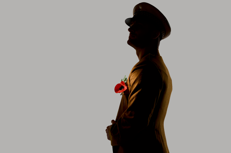 Yesterday I conducted a much more thorough test shoot for my billboard idea. I’m really pleased with how these shots came out. I’m feeling really positive about my Poppy Legion idea.
 This image was lit with three lights. Two strips on the background and one snoot providing the spotlight effect on the poppy. I was also using a silver reflector to bounce the snoot to add a bit of light ton his back. I had to have the snoot in a lot closer than I expected to, I learned this on my
 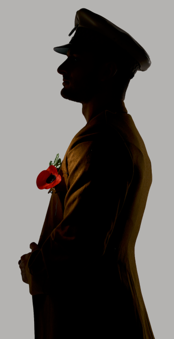 I do feel that this shot could’ve potentially been a tiny bit better though. I think that if the model tilted his head a bit more to right [just like the image on the right] so we got a profile shot. This image would’ve near amount been perfect. Also if I moved the snoot a bit to the right so the light truly fired onto the poppy, whereas in the above image, it is slightly backlit.
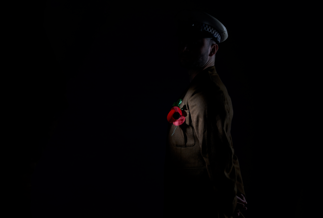
 As random luck would have it, when I took the first shot, only the snoot fired and it resulted in a really hard lit image of a poppy on a chest with a black background. Lauren felt I should do this rather than the white/grey background, to which I saw where she was coming from saying that the poppy stood out even more, however it’s tough to see the silhouette of the soldier. I did try to persevere. Bouncing a barehead RX600 off of a white poly and using a black poly to flag it off the background. In hindsight, I should’ve used the wooden V but there wasn’t enough room for the angle.
 I decided to try one final shot, where I lit the front of the model, but I didn’t like these shots as much as I like the silhouetted ones.
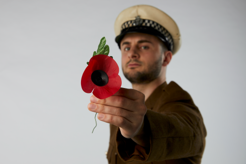


 I also feel I made a bad choice with the lens. I shot everything on the 55mm lens and as a result, I’m not overly impressed with some of the poses which look a tad bit uncomfortable, which I think the wide angle perspective hasn’t helped at all. In hindsight, I should’ve gone further back with the camera and used the 80mm. There was also an image that I was intending to use for social media where I should have used the Cambo tripod, the three subjects are on the floor and I thought I could shoot it with the normal tripod and now these feel like snapshots and don’t really look that good.