On the Friday before last, I went on a Leica workshop. This one wasn’t like the other ones from this year. This one was about portraiture. So I was really being taken out of my comfort zone. This was led by portrait, editorial & advertising photography Cat Garcia.
Luke Ward-Wilkinson in Wild At Heart
On this workshop, we had a 25 minute shoot with an actor called Luke Ward-Wilkinson who has appeared in Wild At Heart. This instantly gave me a device to build up a rapport with him. I could also further build the rapport by mentioning about my cousin who’s trying to make it as an actor in New York.
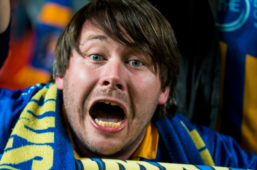
Shrewsbury fan celebrates the clubs goal. Ben Peters
Before the shoot however, we we’re asked to show ten images of our work. I said in my opinion it was tough to pick because sports photography can be very repetitive. When looking at both my sports and my events work, Cat felt that with my portraits I should try to evoke emotion from Luke. To which Julian said he’s good at if you let him know what you want yo create.
Mr Porter. Cat Garcia
Next Cat spoke to us about her style of work. She feels that all of her work, whether it’s commissioned or personal is a collaboration. A portrait is a joint effort. Cat is a massive fan of natural light. The image on the left is one of my favourite. Her work also requires loads of preparation. Cat said she’d been waiting for the light and shadow to be in the perfect location to match the position of the face. This image wouldn’t of been the same if it was shot with flash.
So now onto the shoot itself. I decided to shoot with the Leica SL system with the 24-90 f2.8/4. I was the first up and if I had more time to practice. I probably would’ve taken a chance with the Leica M rangefinder. However I only had 20 minutes to practice. I’m really happy with the shots that I came out with.
This slideshow requires JavaScript.
I decided to go with a mixture of natural and staged images. Feedback of the set was good as well. My peers really liked the colours and poses that I created with Luke. My only regret from the shoot is that all the shots we’re taken in shade so there isn’t as much light in the eyes of Luke that I expected.
The Leica workshop was a great way to end a fun 1st Year at Ravensbourne.
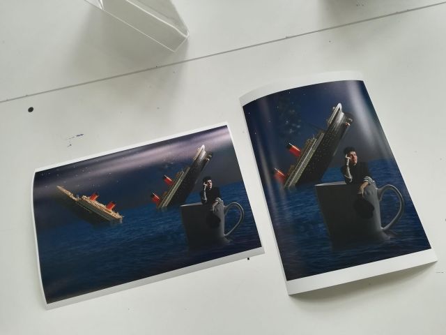
Below are my final prints for my Lavazza composite image. I’m really impressed with the finished product. Here is my moment of reflection of how I got here.
What Went Well:
Ideas
My first experiment with Photoshop from five years ago
At the start of the project I was feeling nervous about the task at hand. I’ve used Photoshop for years, but never for a project like this. The last time I even attempted a comp, this was the result which I did five years ago in GCSE photo. So I wanted to create a comp that was challenging and had a right to be comped, but I wanted to do something that was in my realms of ability. I do however believe I came up with some strong ideas.
My first idea was a spin off of Planet Of The Apes and since then I came up with some strong ideas which include:
Planet Of Lavazza
Boat
Ride
To which initially the boat idea seemed like the forerunner. However this idea would develop into a better one.
Idea Development
When I pitched the idea in the first tutorial, I myself felt like I was lost at sea with the narrative. Matt really encouraged me to push the narrative, why would Lavazza be the the rescue.
He liked the concept but didn’t agree with the portrayal.
This idea did eventually developed and I encountered a confluence. I had the choice, do I have the man escaping from a deserted island or do I go the other way and have the cup as a rescue boat from a sinking ship.
In the end I went with the ship and this proved to be a great decision.
Time Management:
I feel I was pretty strong with my time management. I’d shot the background a week later than it was supposed but I’d got the rest got the rest of my elements shot by the 16th of May. This left me with two/three weeks to assemble my comp. Which I have to spend most time and attention to.
Portraits
Chris was very happy with my portraits. He said they we’re very good as standalone portraits. Matt liked the expression of the final portrait that I used.
I was glad to hear this because I felt that the portrait shoot didn’t go particularly well. I was worried that I hadn’t got the lighting right.
A flash nearly exploding in mine and Elles face the shoot meant I wasn’t in the greatest mood either. However hearing my tutors compliments made me feel more happy about the shoot.
Also with the portrait in my opinion not much retouching was required at all. Cutting out the hair was nice and simple.
Composition:
I really like the composition of my comp. Chris and Matt both believed that it was simple and as a result I could very easily create both a portrait and landscape shot without moving any elements.
Confidence to help:
I can’t deny that this has been a very challenging unit which I’ve enjoyed. It has given me even more confidence to assist my peers and give advice on there comps. Not only in the pre-production stage in the studio but also in the post stage in Photoshop.
Confidence with Photoshop
This is the first time I’ve ever used Photoshop for this kind of project and it has given me a chance to use new tool effectively like the Patch and Pen tool. Now that I’ve used them I feeling more confident about using them going forward.
Confidence with new tools
Not only did this project give the confidence to use new tools in Photoshop, it also gave me confidence to use physical tools as well. For example I purchased a cheap Wacom for this project and it definitely made this comp easier.
Test Prints
I was very happy with the final prints of my composite. I was made even more confident by the test prints. Retouching from a print is such a great way to go about a project like this. There we’re aspects of my image that we’re prominent on the laptop but not in the print, however by looking at a test print, I had a good idea of how to balance everything. I did a total of 6 test prints. So with the final two prints thats 8 visits to the Printshop.
Paitence
This project was a massive experience in being patience. This was need to be able to cut out the Titanic realistically. Not only for drawing the paths with the Pen Tool but also using the Magic Wand tool to remove the areas inside the ladders.
I had to go over the Titanic a 2nd time, I was half way through my comp. However because it was a smart object, I could retouch it as a PSB and not have to copy and paste a new file onto the master file.
Even Better If:
More Ideas
I liked the ideas that I created back at the start but I wish that I thought of even more ideas.
More Research
I wish that I did more research into composite photography. It probably would’ve led to some more creative ideas. I don’t think I did enough research. I think I relied too much on my uncles Annie Leibovitz books to which her portrait work is very different to her composite photography for Lavazza and I didn’t really take much from her.
I should’ve revered engineered examples of commercial photography.
Need to check before printing:
On Monday before the deadline, I decided to print my final images. However on the day after I had to return to the Printshop to reprint my portrait because it was the wrong colour temperature. When I saw the print but I thought it was just because it was cropped. However upon looking at the files, I realised that I’d sent off the wrong portrait file. The same can be said for the portrait submission [which has since been corrected]
Reflections
Without a doubt, the aspect I struggled with the most was the reflections of the Titanic. I’m happy with the end product but if theres no by anything that detracts from the final comp it will be them
Top hat
The only other aspect of the comp that didn’t come out as I expected it was the top hat that Nathan was holding. I feel it was lost too much in the shadow of the cup. Which I’d pulled the shadows on the cup as much as I was willing to. A few people asked what he was holding. Next time I would’ve got Nathan in the same pose but with the hat on, just to cover all the bases.
Tedious
The whole process of making a comp is tedious. It’s a long process that involves loads of trial and error, going backwards and forwards. However it is very rewarding when it’s done.
Seeing on how my Lavazza comp is now officially finished. I’ve decided to do a blog post layer by layer to explain how I got to this image.
The first layer of my comp is the standard background exported out of Capture One.
Group One: Sky
My first port of call was to change the sky. Chris and Matt believed that this image had to be day for night.
This group consists of four adjustments which all have a layer mask. A Hue/Saturation layer where the Saturation has been upped and the Lightness has been lowered has been painting into the sky. Then the three levels adjustments we’re used to make the sky darker. To which Levels 4 and 1 we’re specifically used to bring the moon glare into the frame.
Group Two & Three: Titanic Bow & Titanic Stern
Now it’s about comping the ship into the water. This folder only has one layers, the ship. The folder also contains two sub layers which are there for light sources on the ship. These we’re created using a small brush of yellow paint. Said layer was duplicated six times to give the bright punchy feel which adds depth to the image. [Note: Inner shadow was experimentation with blending options, make no difference to image but forgot to disable them] The folders in this group are the same in Group 3 Titanic Stern.
After this I have a duplicated layer of the sea which I used to paint in a light wake on the water to show the path that the cup had been on.
Group Four: Ship Reflections
Next was undoubtedly the hardest part of my comp. The reflections. This is the bit I struggled with the most. This group also involved the use of displace filters which I had to create a displace PSD file previously, thanks to a Youtube tutorial.
Group Five: Other Elements
The next group was the one that held both my portrait and my cup. This section was tough to get the colour temperature right. After much trial and error I finally managed the match the cup and the portrait.
The important layers are smart objects, so I opened the PSB file and browsed through the Nix collection. To which I decided to use the Monday Morning filter on Nathan. It initially looked B&W so I put the opacity down to 39%.
Group Six: Stars
The final group of my comp is the stars which we’re painted in with a small brush of white paint. Said paint was duplicated several times and lifted to the top of the comp to become more prominent. I applied motion blur to two of the layers to give a twinkle to some of the stars. Finally I painted out a few areas where the moon glare was, so the darker stars we’re more brighter.
The very last layer of the comp was an S-Curve to give the image a bit more punch.
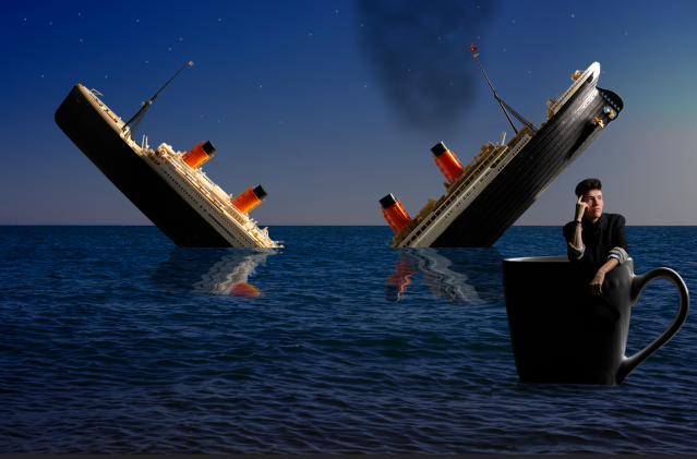
I’m pleased to say that I think that my Lavazza composite is done. After spending hours trying new layouts, reflections and compositions. I now have a composite that I’m happy with ready for the hand-in on Wednesday.
I’m gonna do a detailed blog post about the specific retouching I’ve had to do, from the retouching of the Titanic to the Day for night background. There are 11 groups which comprise of 51 layers. The master file is 383 mbs
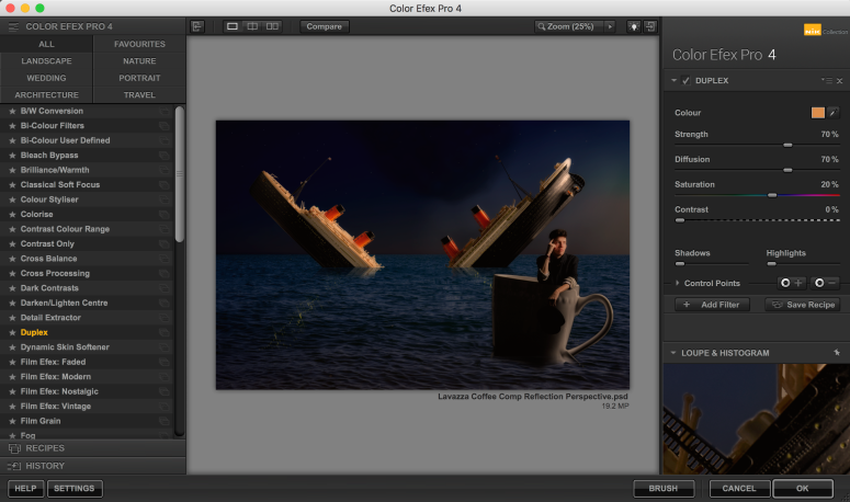
Today I had my seventh and last tutorial for my Digital Darkroom submission. Todays talk was fully about the comp. Before I had a chat with Chris I decided to have a look through the Nix collection. I really liked the mood that the Duplex filter created. It gave an orange tinge, a feel of the sun setting off of the frame. I did however think it was too strong at face value, so I decided to lower the opacity. Chris had a look at it and liked the following was suggested:
Reflections
Chris believed that I had to make the reflections straight on the water. Instead of having having them going in the same direction as the ship. Chris also said that I don’t need to include the light reflections.
Light
Mentioning about the lights. Chris felt that I should make the light coming from the windows and port-holes more prominent. I was wondering how to do because I did have a white glow around the lights but Matt didn’t agree with it. Chris simply duplicated the light layers and they really stand out even more from further away.
Colour Tempreature
Chris felt that I need to pay close attention to the colour temperature of the elements in my comp. Chris noticed on how the portrait was a lot brighter than the cup. The two should be exactly the same.
Smoke
Chris decided to prow through Google to find an image of smoke which I could use as a basis for the smoke in my comp. Chris felt the image on the right would be a good basis. He felt it would make the smoke look sad. Look like the last breaths of the sinking Titanic.
Curves
To finish off both posters, I’ve been advised to add an S-Curve to my image. I have a pretty low key image so adding an s-curve would give the image just a bit more punch.
Test Print
Chris and I agreed that I should do a test print. We are making a print campaign after-all. We need to know how the colours of our images will look when there in print form. They will probably be a bit more dull than they are on my Mac screen.
So after the crit I did a test print. I’m really impressed with the colours. Now that I have seen it in print-form I now have a very good idea of how to perfect this comp.
On Wednesday I had my sixth tutorial for my Lavazza coffee project. This is the stage where I should be heavily involved in the post production aspect. Everything is shot, it’s just about making it all look plausible.
Chris started the tutorial by looking at my comp, he said that he likes it with the ship being lower than the horizon. I must admit, placing the ship on the horizon was a bit of a cop out. It’s a straight line so I only have to have the water as a new layer and I’d already be on my way to having the Titanic sinking. However by doing it lower than the horizon it’s a bigger challenge to make it look plausible but it brings back a sense of depth to the image, the ship was too far away when on the horizon, by making the cup look like it’s closer to the ship adds to the narrative of he has only just escaped. Mentioning the narrative, Chris felt I should keep adding light to the ship. To make the ship look alive and make us think that our model has only just escaped.
Moving onto my other elements, Chris felt that I should play with the shadows and highlights of my model and coffee cup. The shadows we’re very hard on the Model. The main point though was with the coffee cup. Chris once again felt I should lift the shadows to emulate kick up of light from the water. It would also make the cup look a bit more 3D and life-like.
Chris also thinks that the reflections of the ship should be straight. He recommended simply looking up reflections in the sea. He agreed with the distance of the reflections. He also felt that in there current state they we’re a tad bit distracting. I should make them subtle to the point where the original water layer starts to fight it’s way back to the front. Chris also said I’m heading in the right direction with the smoke but I should make it a bit more gentle and less like a v shape.
I’ve just been experimenting with reflections for my Lavazza comp. This is something that I’ve been nervous about. Ever since I saw the ripples on the water, I’ve wondered how I was gonna get the textures right. I feel I have made a breakthrough.
I decided to search up some Youtube tutorials. I came across this one. This video was very helpful but initially confusing. The but of the video that I needed to watch was 2:08 to 5:34.
Below is the process that I did to my Lavazza comp:
This slideshow requires JavaScript.
After going through this process, I did an inverse layer mask and painted the reflection out. This is what my image looked like:
I decided to consult my ever reliable friend Ryan what he felt, he suggested that I make the shadows a tiny bit longer, irregular and darker. Here is what my image looks like now: [I set the opacity to 49%] When my comp is finished. I’m gonna do a blog post where I will show how my comp has developed.
Today I had my fifth tutorial for digital darkroom. However the day before I decided to have a quick chat with Chris.
This is where my comp was when I spoke to Chris. He said I was “definitely on the right tracks” he also felt that the sky should be darker on the left side of the sky. After this Chris gave me an insight into how to add light to the Titanic. He suggested do a levels adjustment then layer mask it over the windows. Then using the paint brush with a warm yellow colour, I should paint it in. This is something that Matt doesn’t fully agree with. I also said to Chris that I’ve had to reshoot my coffee cup because Matt pointed out that the table could be seen in the coffee cup, to which Chris agreed.
The final suggestion was that I should make the smoke a bit more subtle and sadder. He also felt it would feel more dramatic if the smoke was only coming out of one funnel, showing that the other boiler rooms are flooded and the smoke could be represented the last breaths of the ship.
Chris also said that I’ve done a really good job with cutting the ship out, especially with the ladders and the propellors.
My Lavazza comp after the talk with Matt
Onto todays tutorial. The first mention was that the lighting on the portrait and cup felt a tad bit harsh, especially on the portrait. Matt felt that I should pull the shadows and highlights. Matt also felt that I should pull the brightness of the Titanic to reveal the detail of the windows, it would be a shame for all the detail to be lost. I should also increase the brightness of the Titanic because the moon light would be reflected ever so slightly off of the water.
Matt next looked at the water I put over the cup to make it look like it’s in the water. He said I shouldn’t of feathered it. Mentioning the cup Matt also felt that I should use a different angle of the cup. I got another shot that was slightly higher, this shot will make the cup look 3D and potentially give a bit more room to play with the position of the portrait. The last suggestion that Matt said was that I should give the subjects room to breathe.
During both talks, Matt and Chris both felt that I shouldn’t have the ship sinking on the horizon, I should instead having it sinking lower down in the water. I must admit the ship sinking on the horizon was a safety-net, a cop-out you could say. Whereas if I have it lower I would lead to more experimentation. It would possibly be easier to add water disturbance which there would be where the ship is going down.
Apart from that Matt said the comp is coming along well and I have the blessing of time to make the entire scene look plausible. So getting reflections on the water, switching flags around etc.
Yesterday I had my shoot in the Green Room for the portrait element of my Lavazza composite image.
The lighting set up for this was the same as the other elements. An Elinchrom 600 on the right-side of the subject, slightly behind it.
I must say I was nervous about the images of the shoot. I’m still learning how to use my Canon 5D Mk.iv but the images tend to look well exposed on the LCD screen but they look a stop under-exposed on the computer. I think I haven’t got the correct brightness on my camera screen. However after doing a bit of retouching I’ve got a good crop of images.
Below are the contact sheets from the shoot:
This slideshow requires JavaScript.
When Chris looked at them he said some of these work as “stand lone portraits”. I think this is the portrait I’m going to go with for the shoot. I just feel his pose matches the odd satistfaction I’m trying to show of someone who has survived the Titanic thanks to the coffee cup.


 My first idea was a spin off of Planet Of The Apes and since then I came up with some strong ideas which include:
 When I pitched the idea in the first tutorial, I myself felt like I was lost at sea with the narrative. Matt really encouraged me to push the narrative, why would Lavazza be the the rescue.
 Chris was very happy with my portraits. He said they we’re very good as standalone portraits. Matt liked the expression of the final portrait that I used.
 This project was a massive experience in being patience. This was need to be able to cut out the Titanic realistically. Not only for drawing the paths with the Pen Tool but also using the Magic Wand tool to remove the areas inside the ladders.
 I wish that I did more research into composite photography. It probably would’ve led to some more creative ideas. I don’t think I did enough research. I think I relied too much on my uncles Annie Leibovitz books to which her portrait work is very different to her composite photography for Lavazza and I didn’t really take much from her.
 Seeing on how my Lavazza comp is now officially finished. I’ve decided to do a blog post layer by layer to explain how I got to this image.
 My first port of call was to change the sky. Chris and Matt believed that this image had to be day for night.
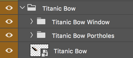 Now it’s about comping the ship into the water. This folder only has one layers, the ship. The folder also contains two sub layers which are there for light sources on the ship. These we’re created using a small
 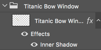 brush of yellow paint. Said layer was duplicated six times to give the bright punchy feel which adds depth to the image. [Note: Inner shadow was experimentation with blending options, make no difference to image but forgot to disable them] The folders in this group are the same in Group 3 Titanic Stern.
 Next was undoubtedly the hardest part of my comp. The reflections. This is the bit I struggled with the most. This group also involved the use of displace filters which I had to create a displace PSD file previously, thanks to a Youtube tutorial.
 The next group was the one that held both my portrait and my cup. This section was tough to get the colour temperature right. After much trial and error I finally managed the match the cup and the portrait.
 The important layers are smart objects, so I opened the PSB file and browsed through the Nix collection. To which I decided to use the Monday Morning filter on Nathan. It initially looked B&W so I put the opacity down to 39%.
 The final group of my comp is the stars which we’re painted in with a small brush of white paint. Said paint was duplicated several times and lifted to the top of the comp to become more prominent. I applied motion blur to two of the layers to give a twinkle to some of the stars. Finally I painted out a few areas where the moon glare was, so the darker stars we’re more brighter.


 I’m gonna do a detailed blog post about the specific retouching I’ve had to do, from the retouching of the Titanic to the Day for night background. There are 11 groups which comprise of 51 layers. The master file is 383 mbs
 Today I had my seventh and last tutorial for my Digital Darkroom submission. Todays talk was fully about the comp. Before I had a chat with Chris I decided to have a look through the Nix collection. I really liked the mood that the Duplex filter created. It gave an orange tinge, a feel of the sun setting off of the frame. I did however think it was too strong at face value, so I decided to lower the opacity. Chris had a look at it and liked the following was suggested:
 Chris decided to prow through Google to find an image of smoke which I could use as a basis for the smoke in my comp. Chris felt the image on the right would be a good basis. He felt it would make the smoke look sad. Look like the last breaths of the sinking Titanic.
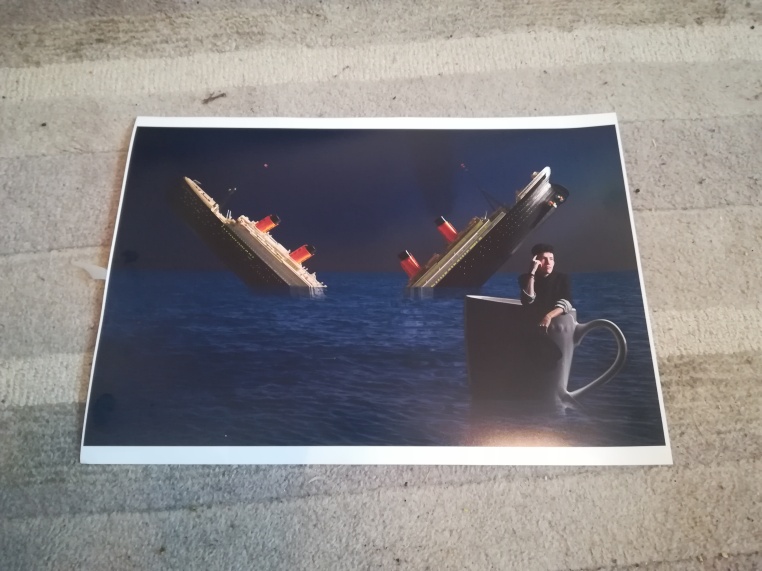 So after the crit I did a test print. I’m really impressed with the colours. Now that I have seen it in print-form I now have a very good idea of how to perfect this comp.
 the horizon. I must admit, placing the ship on the horizon was a bit of a cop out. It’s a straight line so I only have to have the water as a new layer and I’d already be on my way to having the Titanic sinking. However by doing it lower than the horizon it’s a bigger challenge to make it look plausible but it brings back a sense of depth to the image, the ship was too far away when on the horizon, by making the cup look like it’s closer to the ship adds to the narrative of he has only just escaped. Mentioning the narrative, Chris felt I should keep adding light to the ship. To make the ship look alive and make us think that our model has only just escaped.
 I decided to search up some Youtube tutorials. I came across
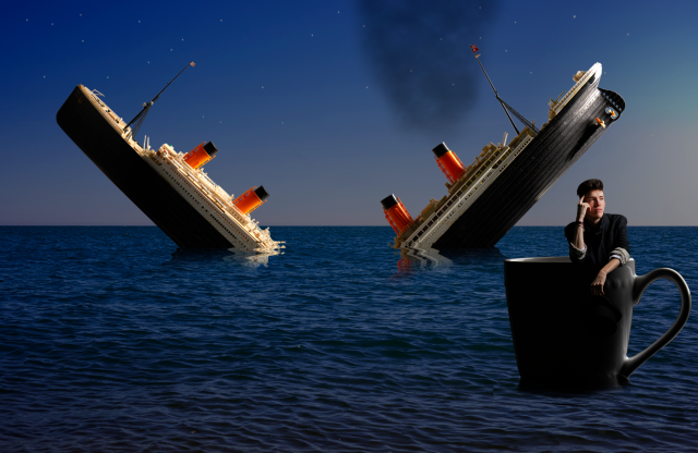

 This is where my comp was when I spoke to Chris. He said I was “definitely on the right tracks” he also felt that the sky should be darker on the left side of the sky. After this Chris gave me an insight into how to add light to the Titanic. He suggested do a levels adjustment then layer mask it over the windows. Then using the paint brush with a warm yellow colour, I should paint it in. This is something that Matt doesn’t fully agree with. I also said to Chris that I’ve had to reshoot my coffee cup because Matt pointed out that the table could be seen in the coffee cup, to which Chris agreed.
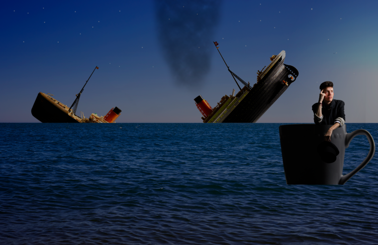

 When Chris looked at them he said some of these work as “stand lone portraits”. I think this is the portrait I’m going to go with for the shoot. I just feel his pose matches the odd satistfaction I’m trying to show of someone who has survived the Titanic thanks to the coffee cup.