Updated article & trying out B&W
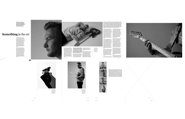
 I’ve been trying out a few different images for my Saturday Supplement article. I’ve going with the plan of not using the detail shot where the hand is playing with the guitar as it stood out too much for the rest of the article. I also decided to go with a different image for the opening.
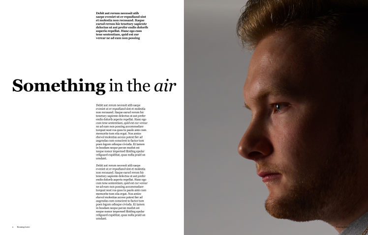
 I decided to heavily crop the image as I liked the harsh lighting, also as he is looking to the left his eyes will point the viewer towards the title. Also I felt it was very reminiscent of Phil Collins I Don’t Care Anymore, even to the point where the catch-light is in the same spot. Just the whole image is flipped.
As mentioned this image is incredibly cropped so I won’t be 100 percent sure about the quality until I do a test print later this week. Which considering the fact it’s full res at 50MP on Phase One and sharp at 100% I’d like to think that the quality is there when it’s cropped. Once again maybe I should’ve shot one close up portrait.
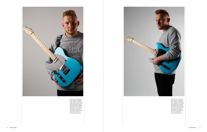 I asked 3rd year Christian for his opinion, which he liked the images, he wasn’t sure about the image on the left of the article, he felt the subject looked a bit off balance, a bit uncomfortable however he liked the lighting and felt the images weres strong.
Christian was expecting to see the detail shot of the hand on the guitar, he saw it on my LinkedIn and he really liked the shot. He did agree with my feeling that it wouldn’t work with colour images. He suggested trying the whole article in B&W. Which I’m not sure about it, there doesn’t feel like there’s much consistency between the images. Also the images are incredibly flat and don’t jump out at the viewer so I will definitely be doing my article in colour rather than grayscale. Another reason why is because there is very little editorial nowadays that is shot in B&W.

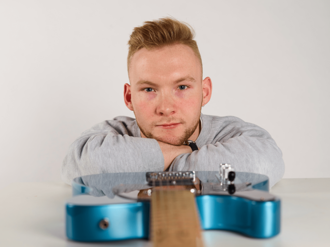 A particular highlight was where I got Hayden to put his head in line with the Guitar. This shot turned out much better than I expected it to. The light was very evenly distributed thanks to an Octabox on the left-hand side from a high and a square softbox on the right of the camera. This added with a close-up polyboard on the right bounced it around. I wish I took the time to capture one image where I shot at aperture like F22, just to see how much of the guitar could be I focus. At the same time, I really liked the depth that the shallow depth of field created but I would’ve had all the bases covered if I shot with a deep depth of field.
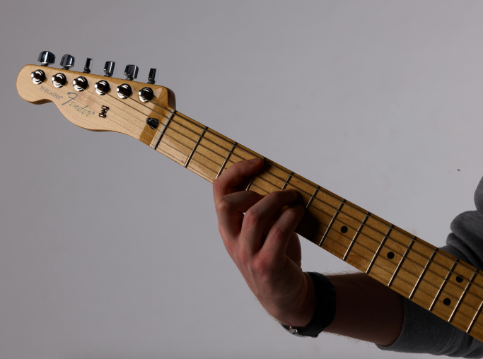 This kind of leads onto how on the other hand I feel this shoot was also a missed opportunity. Some of the shots don’t match as regards to tone this was because some shots had light fired onto the background and some didn’t. An example where this happened was this shot, which I was hoping to include to show that he plays with a Telecaster Fender however in this image where the logo is nice and sharp there wasn’t any light on the background.
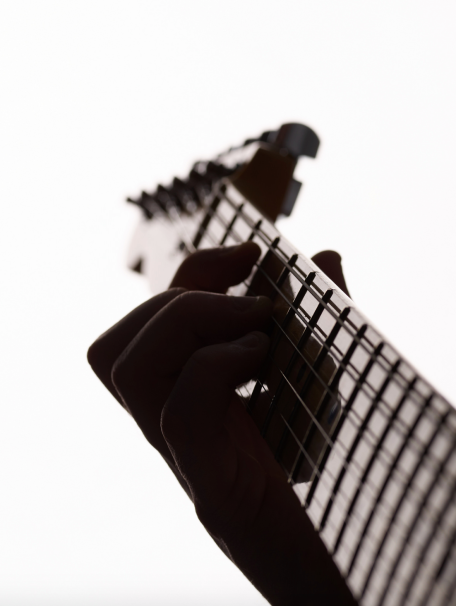 Another image which I wish I took more time with was this one. I was very eager to shoot this image, however, I feel I silhouetted the hand far too much. In hindsight, I would’ve to put a polyboard very close to the subject on the left. I really like the light effect created on the metal finish of the guitar but it’s tough to tell that its a hand. Once again if I spent more time I probably could be got the Phase One to look right down the guitar and it would’ve been easier to show the shape of the hand, a bit like this image I did in my test shoot, then again I was shooting that hand-held so I was much more agile.
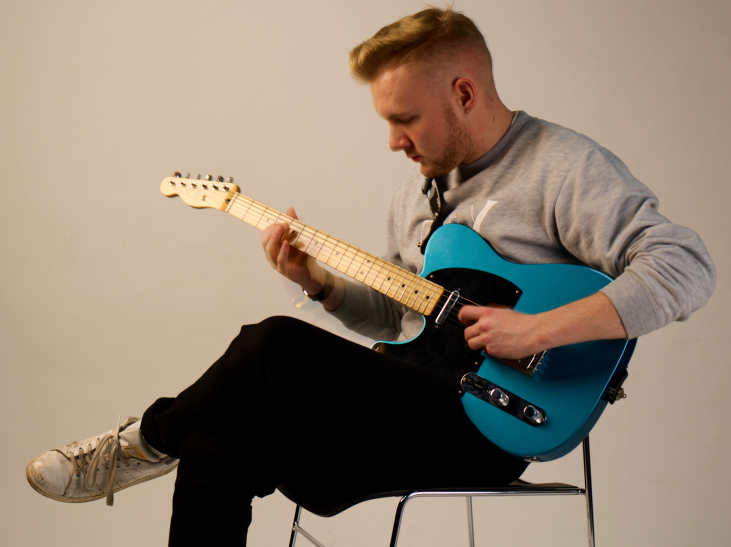 There was also a bit of experimentation that I did in my shoot which I’m pleased I did but I once again wish I spent more time trying to pull it off. Halfway through the shoot, I thought of an idea, I was wondering if I could create an image where I froze Hayden and the guitar but blurred his hands. This didn’t work but this image on the right does slightly demonstrate what I wanted to try, you can see the movement on the right hand. I think to pull this shot off I would’ve needed a snoot lighting just the face and then I could’ve let the ambient light provide the motion blur on the hand. This, however, would’ve led to motion blue of the guitar so this shot most likeely would’ve been too tough to pull off
 For our elective project, we got to having a meeting with the Founder and Director of Vision-bridge.
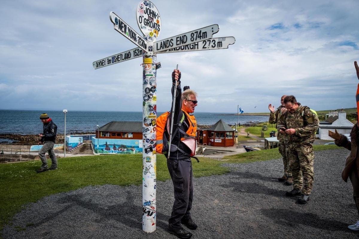 It was great to hear about the Big Blind Walk that he did from Lands End to Jon O Groats. He had so much support which ranged from people walking for a few minutes to people walking many miles with him. He mentioned about a couple of Royal Marines who joined him. When he reached the end one of the Marines ripped his Royal Marine shoulder patch off, which he had worn in Afghanistan and he gave them to Julian saying “you f*cking deserve them”

 I started the edit by setting up a smart folder where I put all the Sharp images. There massive files so when I was going through making adjustments, it would be great if I didn’t have to keep zooming in to check focus.

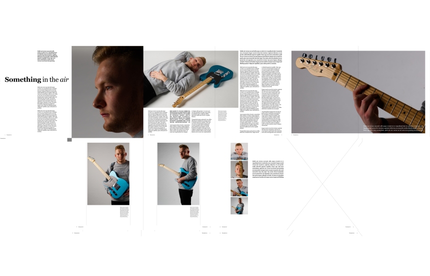
 When I got home, I decided to do a very basic edit and assembled the article of images that we’re unretouched. This was simply to see if I’d got 9 images. I decided to ask my friends what they felt about this layout.
 On the right is the 2nd article I created, this time I used images that I had retouched. I decided to once again ask for advice on this article. I asked my friend Cal Mackenzie who studies film and Bournemouth and is an eager follower of work in Digital Photography at Ravensbourne after studying Foundation here.


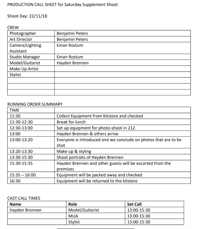
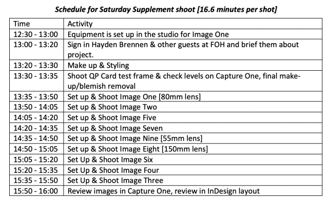
 For this project, I decided to create a schedule as well. I decided to do this as the time in this project is probably gonna fly by. Especially considering that I’m shooting on the Phase One system and with it being shot on a tripod means that I might have to take a bit more time to get the camera in the right position. I’m going to get the shots in the order of lens needed. For the first schedule [left], I decided to give myself 10 minutes per photo, however, I decided to give myself 15 minutes to set up and shoot every image. Yes, this gives me less time as regards to contingency, but I feel confident in getting all 9 images covered with this schedule [below] especially after doing the Phase One refresher last week. NOTE: