Mono Reflection
Below are the four images that I have submitted for my Mono editorial brief. I’m very happy with how this project has gone and I feel that this is a good time to reflect on what went well in this challenging project and what I’d do next time if I received this brief or something similar in the future.

Close Up: Catch lights life the glasses from Nathan and make them stand out

Full Body: Really like the contrast that makes the glasses stand out
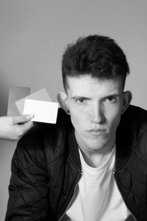
![Something Diffrent: Holding the glasses to the viewer. Looks like he is about to put the sunglasses on to shield the sun [softbox]](https://i0.wp.com/benpetersdigitalphotography.wordpress.com/wp-content/uploads/2018/02/6th-front-cover-21.jpg?w=156&h=250&ssl=1 "6th Front Cover 2")
Something Diffrent: Holding the glasses to the viewer. Looks like he is about to put the sunglasses on to shield the sun [softbox]

Waist Upwards: Really like the arrangement of type and imagery
What Went Well:
I think I got a wide range of images during my shoot with Nathan. I covered all the poses I wanted to and I came out with even more poses. As a result I feel I have met the brief of having four different poses. I have a close up, waist upwards, full body and something different.
When I showed these four images to my friend, the first thing he said was “Did you intend to have the model to hold the glasses in all four images“. I didn’t realise this but I fell it establishes a running theme, it also shows the model interacting and maybe liking the sunglasses.
I feel that I was fairly confident in portraying my ideas to Nathan and he really helped with recreating my ideas. Some pose I didn’t have any examples sketches of old images to show him so he had to rely on my direction of my body and words. Which I felt I delivered clear instructions. I defiantly built up a really good rapport with Nathan which is really important. PA photographer, founder of Stella Pictures Ltd. and acquaintance of mine, Daniel Hambury an editorial photographer said “I learnt very early in my career that portraiture is a combined effort between the subject and myself. If they don’t buy in to my idea it shows.”
 I think my decision to create a questionnaire was a good call. I had personal connection to these images, so I felt it was important that I got an outside perspective of my images. I had to be careful though because this was too a strict brief that is why I stated in the intro the following:
“The Masthead “Mono” & “Art Fashion Architecture And Music Issue_01” can’t be moved. “Shady Deals” & “Glasses Define The Look” can be moved. Imagery and text have to be in Black & White.”
However it would seem that some people didn’t follow that as people said that maybe the type Mono could be moved. However it provided a nice range of feedback which I even got a response from Tom Miles where he said if I wanted to I could get in contact with him for further more detailed feedback.
I think we worked well as a team. We spoke to each-other on a few occasions beforehand so we knew what ideas we’d all be attempting, so we had a plan of where to put lights, whether we should use a soft-box or a beauty dish etc. Also because we weren’t tethering, there wasn’t a need for a digi-op. So we could focus on one light each.
Also after our talk in December, we set up a group chat so we could discuss ideas and we could also discuss what equipment we could use.


I think that I initially developed some strong ideas. I was really excited by the idea that I went into the talk with Terry and Matt. I felt this was very strong, to which Matt and Terry agreed. However a few days before the shoot, I postponed the idea, I felt that I wouldn’t have enough time to create this shot. However when the actually had the shoot, I felt much more confident about the idea and I believe I have successfully shot it. The main confidence boost, was finally being able to get the flash in sync. I wasn’t sure how to do it, but it was very simple on the day of the shoot and as a result, I was able to shoot it. I only wish I tried this shot on a white backdrop as well.
 Also when I was sketching my ideas, I always had this sketch next to me, just to remind me of where the type is. To counter the type, all of my sketches we’re done on the right side of the frame, or right in the middle. Other sketches for my shots can be found here.
Next Time:
Finding a model for my shoot was particularly tough. I contacted the following agencies, Nii, DAM & Base. I even signed up to Fashion Monitor but I struggled to navigate and make use of the website. I really thought I’d left it too late. I never started contacting until December, the month before my shoot. I never heard back from Base. Nii was inconsistent will replies. They took two weeks one model was no longer on there books and five weeks to say that a model wasn’t available, which when I went back asking for more they never replied. I must admit, I have a feeling that Nii agency is just a man with a laptop because it’s address is a house in Lewisham and theres nothing on Companies House, as a result I had no way of getting in contact over the phone.
Then I spoke to DAM, there were a few off days when it came to emails but I eventually broke through when the said that Nathan would be available. I was looking for models who hadn’t done many shoots because I felt they would be most happy to test shots, however I had to be cautious that they weren’t inexperienced. Which I will be completely honest I was a tiny bit worried because Nathan only had two shoots on his page. However Nathan was very professional during the shoot, he was always helping with the set up and he carried out my poses with confidence.
The day before the shoot, I was nervous that Nathan wouldn’t turn up. It was such a relief when Nathan text me asking if I was the photographer for his shoot. Not only did it secure his presence, it also gave us an opportunity to confirm ideas that I had which had been passed on to him.
 I did QP test shots during my Mono shoot however I only did two, one with a black backdrop and one with a white backdrop. However I really should’ve done QP card shots every-time I changed the lighting set up. This is because when lights were moved around, the intensity on Nathan would be different, so an adjustment for an image where the light is 10 cm’s away, wouldn’t match an image where a light is 50 cm’s away. Luckily it doesn’t seem to of meant that the exposure of images were out, however on the next shoot, I might not be so lucky.
Following on from test shots, I didn’t do a dry run. In the end I was confident with the poses I had to recreate, but it probably would’ve made me feel even more confident if I did a test run, it would’ve meant I could’ve created more accurate lighting diagrams to use in the shoot. It defiantly would’ve given me even more practice with synced flash and I possibly could’ve planned and done even more complex shots.
I must admit, I feel that my shots involved some fairly simply lighting set ups. Maybe I should’ve taken time to create some images with some more sophisticated lighting set ups. Maybe I could’ve backlit the subject. Maybe if I did a dry-run I could’ve test it out and then execute it in the shoot.
 A few days before the shoot, I planned to shoot tethered. This was because of a tool that Chris taught us about where we can have a png of the Mono layout and they would be overlaid as we shoot. This would’ve helped me with the image I took on the right. The pose and position of the catch lights we’re perfect. However I didn’t leave enough negative space for the masthead. Luckily there was room for the type to be cut in half, which I didn’t know how to do it initially. Yes I did print out the Mono layout beforehand, but it’s seems this still wasn’t enough the remind myself of the composition I had to shoot.
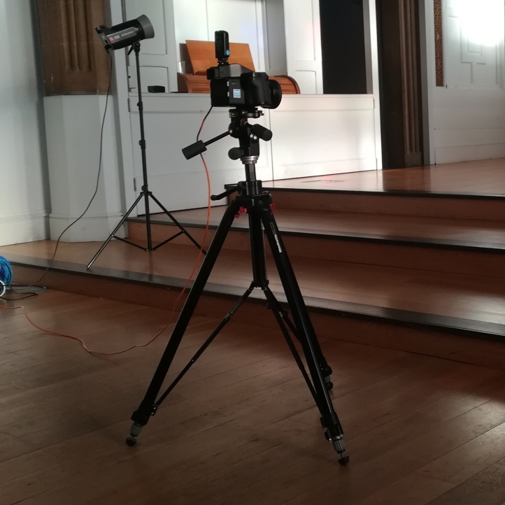
However if I was gonna shoot tethered, I was gonna have to shoot on a tripod. Which isn’t how I like to shoot I prefer to move around and shoot. This is something that I’d have to adapt to.
On another note, maybe I should’ve tried extending the frame and painting it black so I could have the type as one line on the left, above hand.
 If I did this project again I would do more research, I think I narrowed myself by looking at photography that used sunglasses, ideally I would’ve conducted more research into ID magazine and maybe a few more publications. I only looked at a couple of covers for ID and it led to my idea of using split lighting, because ID are famous for only showing one eye on there front covers.
I was glad that I did a survey about my front covers. But if I had time, I would’ve actually printed out all the covers I’d made and I would’ve just started at them for half and hour. Certain covers would pop out more than others. Giving me a rough idea of what are best. My tutor is foundation always said “The life of an image is in the print“.
If I was gonna do a project similar to this, I’m hoping to have more structure to the shoot. Before the shoot I’d planned to spend 20 minutes on each pose. We could spend 22 and 1/2 minutes on each pose but if I spent just 10 minutes per shot that would leave 10 minutes as contingency. However I didn’t experience that at all. My shoot started at 2 and I felt I was finished by 3, to which I had the space booked until 3:30. Maybe I should’ve kept shooting till, it might of given me a tiny bit more variety. Rather than focusing on one pose from a time, it was more a case of jumping from pose to pose.
I turned up to the shoot without my sunglasses. Luckily I only live in Kidbrooke, ten minutes away so my dad was able to run them down. To avoid this in the future, I will have a checklist in my bag. Tom Miles has around 10 bags and cases worth of photography equipment and every bag has a certain piece of equipment which never changes. This way when he knows what equipment he needs he just grab the bag and go.
 Next time, I’d make sure the equipment is booked much earlier. I finally completed the risk assessment after 3 attempts on the Monday before the shoot. I was really worried that I wouldn’t get it done in time. Wo which I’d already prepared an expensive shopping cart at The Flash Centre and I was ready to pay for me and my group to use it because of how late I submitted the equipment to the CLR.


 A week days ago I came across a video on Youtube which I thought I should do a blog post about. I’ve been a follower of COOPH for the last few years. They recently uploaded a video about their key steps to becoming a professional photographer.


 Next Julian spoke about my Fanzine. “And looking at Fanzine. Very much the sort of thing that you may well get at a football game and you’ve probably been looking at Charlton’s own or similar, whether it’s their fanzine or their programme.” This is an avenue of research that I undertook. I looked at Voice Of The Valley which the fans created. I did consider looking at the programme Valley Review but I felt that was too serious. “not a programme as I remember programmes at football matches. It’s more than that, it’s very well done indeed. With lots of photography. And its not all been done on one session or one day.”


 I feel that I came up with some good ideas, this started out by doing a spider-map of my interests so Music, TV, Photography, Locations etc. I initially had a wide range of potential ideas however nothing really stood out. Nothing seemed like it had the potential to be a 20-24 page fanzine. However I had a
  I feel that my fanzine has developed strongly since my talk with Matt and Terry in Decemeber.
  The final aspect that had developed strongly is the size. Initially I sized my fanzine to 270mm by 210mm because according to
  I’d say I’ve ticked all the boxes of the brief. It’s 24 pages long, I’ve designed the front cover with a Masthead, it’s full colour and I have the full variety of images. I have a two double page bleeds. I have the single page bleed with type on the opposite page for my introduction. I have an image with type over it and I have a collage of images that work well, however I think the collage could’ve been ever better. I also believe it looks professional as it’s been printed. Maybe it would’ve been worth me adding a finish when I printed at Mixam but I’ll be honest I’m not sure which one would’ve worked best.
 I feel that some aspect of my file management we’re pretty good. When I started to assembly my Fanzine I got a few broken links because I thought I only had to place an image and that was that. So to counter this. I assembled an image folder where I listed what page the image would be on.
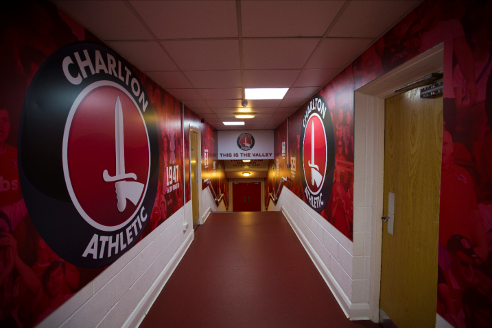 For this project I didn’t have a chance to do any QP card test shots. I’d imagine for sports images it would be very tough to use white balance cards depending on the location of the player within the frame the intensity of light will be different so the white balance cards would possibly be inaccurate. However there are a few instances where I could’ve and should’ve used QP cards. For example the wide angle shot of the Valley I should’ve and the shots taken inside the tunnel. Once again like Mono my exposure and white balance seems to be fine. Next time I might not be so lucky. It’s something I will make sure to do in the future. Also at my next game, I might get one image of QP cards in sunlight and one in shade, just to see what they look like when they are applied in post.
 I’m happy with the collage of images that I used for my project, I however do wish that I’d consulted someone on the graphic design course just to help with me combining images to see what works. I have a personal connection to these, so I know what order they we’re taken. This however doesn’t translate into images that work in a sequence. I believe I have got some images that work together but if I had time I would’ve asked for a send opinion, and I probably would’ve asked if they could’ve constructed something graphic.
 I wish that I’d done more research into fanzine. Terry recommended that I looked at Mundial, however I didn’t have a chance to.
 I don’t have every single RAW files to this fanzine. This is because the two images of myself, we’re shot by two fellow photographers and I don’t have the RAW file to the front cover. This is because it was shot before I started at Ravensbourne and I stupidly thought I wouldn’t need the RAW file anymore. I however did want to keep this image because this is my strongest Charlton image.
 As a matter of fact, I changed the images of my collage because of missing RAW files. The opening article was going to be about Charlton Atheltic vs Portsmouth. I had the edited jpegs, but I no longer have the original RAW files. This match was shot after I started my course, so there was no excuse for me not backing up the RAW files because I never know when I might need the originals again. But I switched the articles and images to a match which I still have the original RAW files. In my opinion, the replacement article is much stronger and the images are as well.
 I wish that I’d waited just a few more days to print my Fanzine because this would’ve meant I would’ve been able to edit my images with the
 To compromise I decided to print them like this, where I’ve cropped the pass so you can see what type of pass it is but people can’t see what the entire pass looks like, so people can’t make counterfeit ones.
 My Fanzine has arrived from Mixam Printing. I had to go to the DPD depot to collect it because of the snow. As a result it wasn’t expected to arrive until Monday. However I decided to go and collect so I had time to order a re-print if need be.
 My Fanzine order from Mixam will arrive tomorrow. I can’t wait to see the finished product

 Yesterday I ordered my Fanzine. I’ve decided to go with Mixam Printing rather than SBS. I’ve wanted to keep my options open so I’ve decided to order from Mixam, to which if I’m not satisfied, I still have some time to print from SBS.
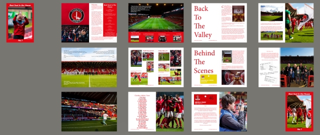
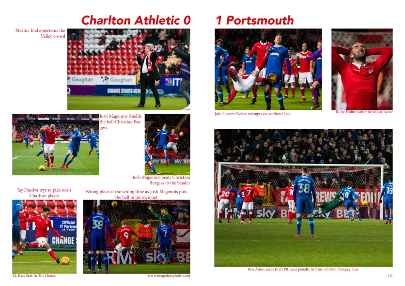 I’ve decided to put my zine through some siginificant change to it’s content. Firstly the Charlton 0-1 Portsmouth article and collage [right] has been replaced with the Charlton Athletic Legends United match [below]. I decided to do this because the images are stronger and there is a lot more to say about the event.
 One article that I have decided to tweak for security reasons is the final article where I was going to include all my passes on the page. I’ve given it some thought and I’m not sure if I’m actually allowed to share images of the passes. If the wrong people see it, they could produce counterfeit media passes. Which is a shame because I was hoping to have my Premier League pass on there to show that I’d photographed in the top division of English football. So as a compromise. I’ve decided to crop the passes so they include the club logo and the type of pass that it is. So that way the viewer will know I have Access All Areas, with out showing the image watermark and the layout of the pass itself.