

Feedback for Mono & Fanzine
A few weeks ago, I received a B+ for my Mono and Fanzine submission [subject to moderation] Below is a summary of the audio feedback.
Video One: Julian Hawkins & Terry Hawes
I must admit listening from Terry’s feedback of my Fanzine. He liked the end product, but it wasn’t exactly what he expected. Which is a shame because he felt really confident in the idea. I believe this because there were many pauses in the feedback and sometimes it felt that Terry had to think really hard for some positives.
Terry also said “you’ve got the mechanics but you haven’t put it into practice” this was because I set up a grid and bleed marks but I “haven’t used the full bleed, you haven’t extended the full bleed box out“.
One final thing Terry picked up on is “less is more“. Terry felt that there was slightly too much content, which to be honest I expected to hear. I was worried about the amount of words. “you’ve got all the appropriate, correct information but theres too much of it” Terry did however finish this thought with “Your enthusiasm just bubbles out of the pages which is a joy to see. So I think photographically, it is strong, lots of good elements, so well done. It is a nice piece of competent work.” So in my opinion I received some very constructive feedback from Terry as regards to Fanzine.

Next Terry gave feedback for my Mono submission. “Mono, lots of different variety of shot choices, you’ve got evidence of moving the type around“ I’m also pleased to say that Terry really liked the image on the left, it was my favourite image from the shoot.”I love the close up of the guy taking the glasses off.“ One thing that potentially could’ve been a bit better though was my final placement of the type. “The type is a little bit, the positioning could be a little bit tighter. You’ve used some interesting crop ideas.“
The last comment of Mono from Terry was “Yeah, you’ve defiantly had a good go, you’ve seized the project, the ball by the horns had a good wrestle with it. Exactly what I wanted to see.”
After talking about the Fanzine. Julian proceeded to talk about my workbook. Julian started by saying “it’s excellent actually and it’s very very clear, follow, easy to navigate.” However the one problem that I do have to address is the lack of references. These can be “other photographers, people who are inspiring you, people who are maybe working in the same way that you want to work. Peoples who’s ways of working or ethos or style is something that you’d like to carry over into your way of working”
Video One: Julian Hawkins & Chris Frazer-Smith
Julian kicked this video off by talking about my conduct within the studio. It would seem that Julian was very pleased with the conduct of me and my team in the studio. “Very well organised, you were in on time your pre-booked and collected all your CLR equipment on the Friday before and stored it. And as a team, you we’re all very good at helping each other, which is very good to see. Very professional and very mature, I don’t see enough of that.”
Next Julian spoke about me as an individual. He felt that I had a very good comprehension of my camera and the technical side of photography. This is something I strongly agree with. My skills are in the technical side, but there are still new things to learn about my camera. I’m also keen to improve more on the meaning and the theory of photography. Julian followed up with this summary of my Mono shoot “Your imaginative with your poses and lighting, you did two different backdrops. You got the model to do different things. You had a clear idea in your head of what you wanted to achieve and directed your model accordingly”
Next Chris gave me feedback. “It looks very confident. I would say that you’ve tried some different things lighting wise. Which is nice to see. Your missing the full-length shot. Which is a shame. But that doesn’t take anything away from the fact that you look confident.” I must admit I couldn’t get a full body shot of Nathan because he’s 6 ft 2″ and his head was at the top of the colorama. Yes I could’ve done some cutting or manipulation in Photoshop but sadly my shoot was before the specific Digi Darkroom lessons and it wasn’t really something I’d tried before. It however would’ve been good experimentation though if I gave it a try. Chris followed on saying “Not only in your technical ability behind the camera, with lighting and directing your model in the studio. So yeah well done… You know, keep on using your game all the time and pushing your comfort zone.”
 Next Julian spoke about my Fanzine. “And looking at Fanzine. Very much the sort of thing that you may well get at a football game and you’ve probably been looking at Charlton’s own or similar, whether it’s their fanzine or their programme.” This is an avenue of research that I undertook. I looked at Voice Of The Valley which the fans created. I did consider looking at the programme Valley Review but I felt that was too serious. “not a programme as I remember programmes at football matches. It’s more than that, it’s very well done indeed. With lots of photography. And its not all been done on one session or one day.”
After this Julian spoke about me as a sports photographer with Charlton. “you’ve got a strong involvement with the club, you’ve got the access, they give you press access. Developing that sort of relationship with people is so important and I know it’s an area of photography that you want to go to. However I will say this to you and this is just an overall general thing. Make sure that you have all the other skills in your photographic bag… If your good, they like me in this sort of circuit. You will find that you get asked to do other things for them. It might just be people in the directors box shaking hands,” As a matter of fact, I’m currently standing in for the hospitality photographer Tony Mitchell I however fully understand what Julian means, I needed to make myself as well-rounded as possible to stand out. Also I said at the end of my fanzine that to be a club photographer, you really need to be a jack-of-all-trades kind of photographer.
Chris felt that there was potential for this to be a personal project. “I very much like this ongoing project for you Ben… more that can be achieved here, where you get your camera into certain places now you’ve got the agreement and understanding and relationship with Charlton. It’d be nice to see you in the dressing room, before the game, where all the kits are laid out before the team arrive.”
Overall I’m happy with my grade for Mono & Fanzine I do however feel that I made a few significant errors, mainly in the production side which hindered my grade from being better. I’m still very content with a B+ and I definitely know how I would tackle this or a similar project if I had to do it in the future.


 I feel that I came up with some good ideas, this started out by doing a spider-map of my interests so Music, TV, Photography, Locations etc. I initially had a wide range of potential ideas however nothing really stood out. Nothing seemed like it had the potential to be a 20-24 page fanzine. However I had a
  I feel that my fanzine has developed strongly since my talk with Matt and Terry in Decemeber.
  The final aspect that had developed strongly is the size. Initially I sized my fanzine to 270mm by 210mm because according to
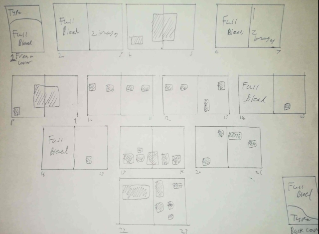
  I’d say I’ve ticked all the boxes of the brief. It’s 24 pages long, I’ve designed the front cover with a Masthead, it’s full colour and I have the full variety of images. I have a two double page bleeds. I have the single page bleed with type on the opposite page for my introduction. I have an image with type over it and I have a collage of images that work well, however I think the collage could’ve been ever better. I also believe it looks professional as it’s been printed. Maybe it would’ve been worth me adding a finish when I printed at Mixam but I’ll be honest I’m not sure which one would’ve worked best.
 I feel that some aspect of my file management we’re pretty good. When I started to assembly my Fanzine I got a few broken links because I thought I only had to place an image and that was that. So to counter this. I assembled an image folder where I listed what page the image would be on.
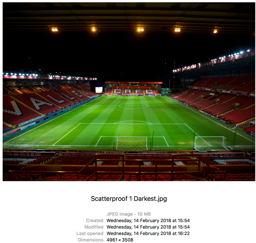
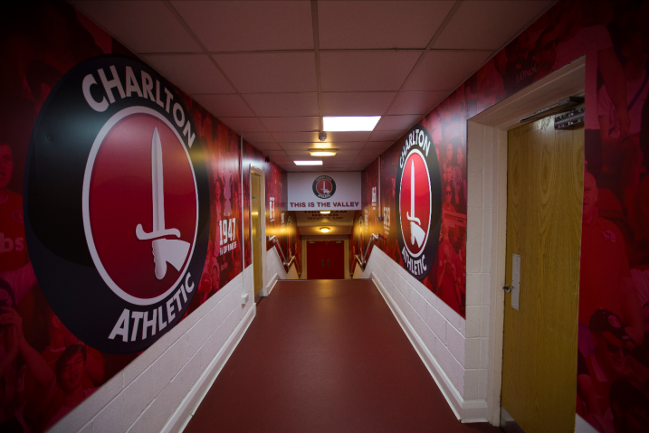 For this project I didn’t have a chance to do any QP card test shots. I’d imagine for sports images it would be very tough to use white balance cards depending on the location of the player within the frame the intensity of light will be different so the white balance cards would possibly be inaccurate. However there are a few instances where I could’ve and should’ve used QP cards. For example the wide angle shot of the Valley I should’ve and the shots taken inside the tunnel. Once again like Mono my exposure and white balance seems to be fine. Next time I might not be so lucky. It’s something I will make sure to do in the future. Also at my next game, I might get one image of QP cards in sunlight and one in shade, just to see what they look like when they are applied in post.
 I’m happy with the collage of images that I used for my project, I however do wish that I’d consulted someone on the graphic design course just to help with me combining images to see what works. I have a personal connection to these, so I know what order they we’re taken. This however doesn’t translate into images that work in a sequence. I believe I have got some images that work together but if I had time I would’ve asked for a send opinion, and I probably would’ve asked if they could’ve constructed something graphic.
 I wish that I’d done more research into fanzine. Terry recommended that I looked at Mundial, however I didn’t have a chance to.
 I don’t have every single RAW files to this fanzine. This is because the two images of myself, we’re shot by two fellow photographers and I don’t have the RAW file to the front cover. This is because it was shot before I started at Ravensbourne and I stupidly thought I wouldn’t need the RAW file anymore. I however did want to keep this image because this is my strongest Charlton image.
 As a matter of fact, I changed the images of my collage because of missing RAW files. The opening article was going to be about Charlton Atheltic vs Portsmouth. I had the edited jpegs, but I no longer have the original RAW files. This match was shot after I started my course, so there was no excuse for me not backing up the RAW files because I never know when I might need the originals again. But I switched the articles and images to a match which I still have the original RAW files. In my opinion, the replacement article is much stronger and the images are as well.
 I wish that I’d waited just a few more days to print my Fanzine because this would’ve meant I would’ve been able to edit my images with the
 To compromise I decided to print them like this, where I’ve cropped the pass so you can see what type of pass it is but people can’t see what the entire pass looks like, so people can’t make counterfeit ones.
 My Fanzine has arrived from Mixam Printing. I had to go to the DPD depot to collect it because of the snow. As a result it wasn’t expected to arrive until Monday. However I decided to go and collect so I had time to order a re-print if need be.
 My Fanzine order from Mixam will arrive tomorrow. I can’t wait to see the finished product
 Yesterday I ordered my Fanzine. I’ve decided to go with Mixam Printing rather than SBS. I’ve wanted to keep my options open so I’ve decided to order from Mixam, to which if I’m not satisfied, I still have some time to print from SBS.
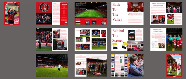
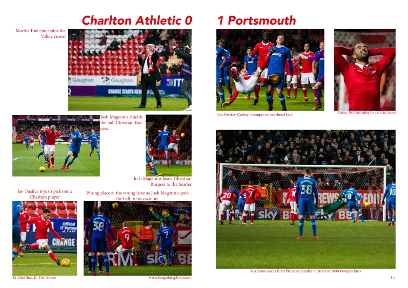 I’ve decided to put my zine through some siginificant change to it’s content. Firstly the Charlton 0-1 Portsmouth article and collage [right] has been replaced with the Charlton Athletic Legends United match [below]. I decided to do this because the images are stronger and there is a lot more to say about the event.
 One article that I have decided to tweak for security reasons is the final article where I was going to include all my passes on the page. I’ve given it some thought and I’m not sure if I’m actually allowed to share images of the passes. If the wrong people see it, they could produce counterfeit media passes. Which is a shame because I was hoping to have my Premier League pass on there to show that I’d photographed in the top division of English football. So as a compromise. I’ve decided to crop the passes so they include the club logo and the type of pass that it is. So that way the viewer will know I have Access All Areas, with out showing the image watermark and the layout of the pass itself.

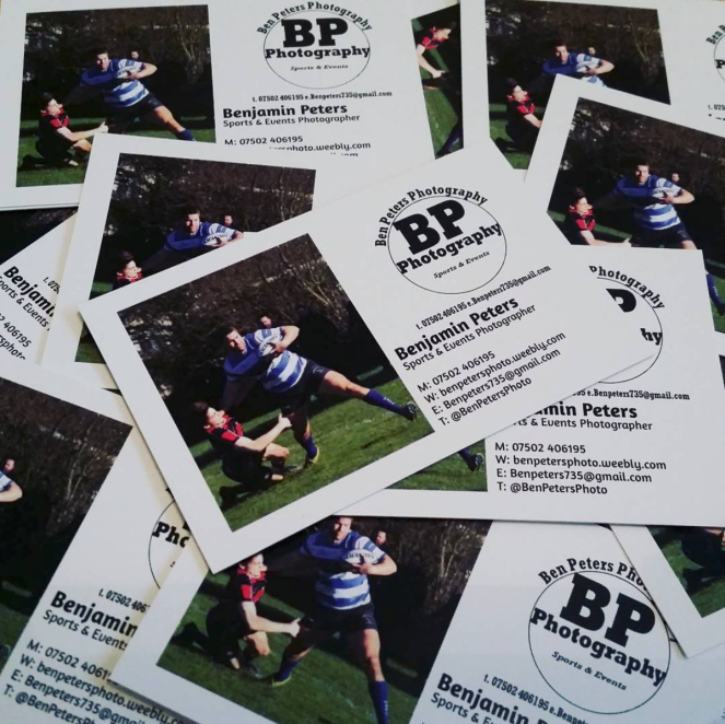 We also mentioned about business cards. On the right is the business cards I made for last years degree show. These are in the process of being upgraded.
 The next thing we discussed was my WordPress. Julian recommended that my theme be changed. I had the Apostrophe 2 theme which I liked because of the feature images. However Julian felt this wasn’t a good layout. Julian wanted to be able to instantly see my thoughts, which with this he can’t without having to click further into my blog.
 Why FT? Who buys it, rich people in particular bankers. It is aimed at an expensive demographic, which means they can up-sell it. This in turn, leads to a big budget in both art direction, which comes from both sales and placement of advertising.
 One thing that was mentioned to me was a “Book-in-a-box” called The Unfortunates. It was written by BS Johnson. In this book you get a beginning and end. But there is no binding. There are 25 extra chapters which the viewer can read in any order and it will still be linear.
 Another book which was mentioned to me is The Book That Can’t Wait which was written by Argentine Eterna Cadencia. This book came in a vacuum bag and when the vacuum was opened/broken. The print and type will disappear after two months.

 This reminded me of a moment on the Charlton 06-07 season review where I can see myself waving at Alan Pardew. This was in my first season, so would be great for a start of the fanzine. [I’m in the white shirt as stated in the introduction]

 The original jpeg files which are 300 dpi, even when sized to A3 were coming up at 10-12 megabytes. I was very concerned about this. Especially considering that my response for foundation which was 35 inch at 300 dpi [110 mega-pixels] it was only 6 mega-bytes.
 So I panicked and I resorted back to my process from last year where I only shot jpegs which were 72 dpi. I upped said images to 300 dpi. Then when printed they seemed perfectly fine and sharp. However unfortunately this hasn’t been the case with these prints.
 Also I decided to blend the people out of the image because I felt they we’re distracting