Nix Collection
 Today I’ve been on a journey of discovery as I’ve been exploring the Nix filter collection in Adobe Photoshop. It is a piece of software that houses and range of filters that range from semi-professional to professional. Most of them really feel like Instagram but if used professionally and with patience they can actually do a really good job and establish a style within your images.
The filter set that we primarily worked with is Color Efex Pro and Silver Efex Pro. Dfine can be good to use if you need to reduce noise in an image. HDR Efex Pro is what you expect.
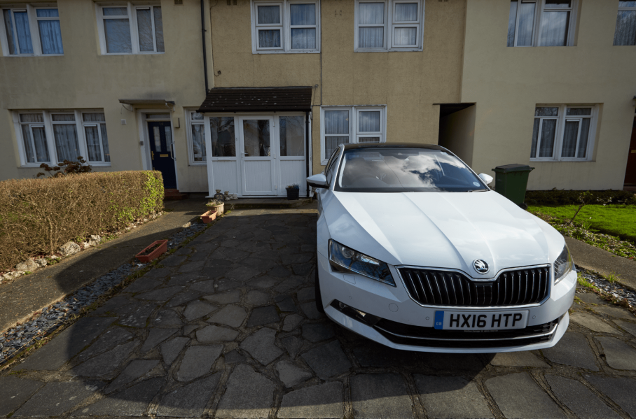
I decided to start my exploration using this image of my Dads car that I shot for the Car Comp project. I felt this would be a good image to experiment with because of the range of shadows and highlights.
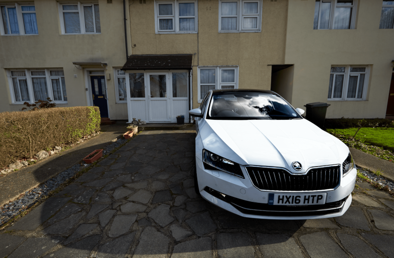 I started off by using the Tonal Contrast [strong] I felt this gave the car a bit more punch and lifted it from the background. I also applied an invisible layer mask and painted just the car back in. I did this with my Wacom which I’m slowly gaining confidence in using it.
 After this I decided to apply another filter. This time I decided the Midnight filter. When I first saw it in the Nix collection I wasn’t sure what I could do with it. It just seemed like the detail in the layer were completely lost. However I remembered that the filter was applied with a new layer and I could create an invisible layer mask and brush the previous layer in.
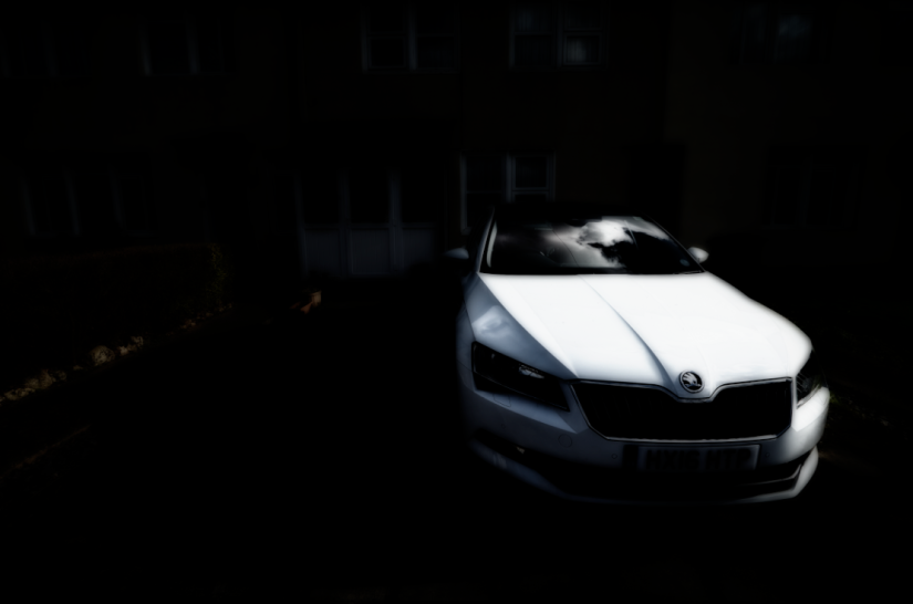
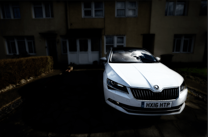 So I create an invisible layer mask and decide to brush the car in. Now the car really stands out, however the background is still pretty much lost. So I decided to set the opacity at 50%. I liked how this made the brought the back but still makes the car stand out a tad more.
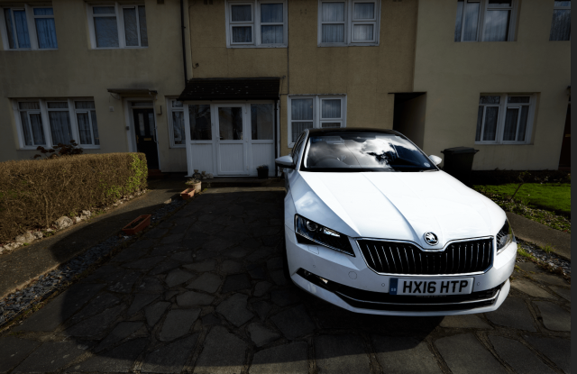
Below is my final shot

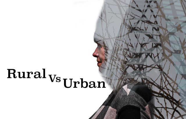
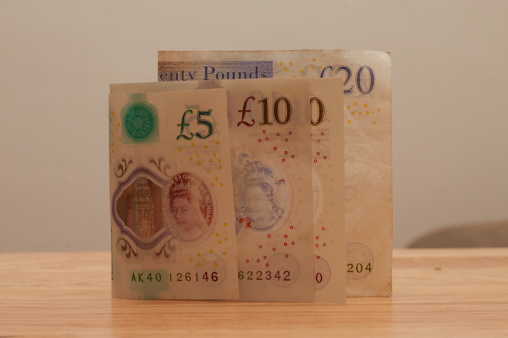 It’s seems that I had to shoot landscapes to comp in. As a result I came to this task with images of money to comp into the portrait of my mum who works in finance. Anyway the lesson started with as going out and shooting some images that would be graphic. It had stopped snowing, but this meant there would be a strong contrast between objects like branches and fences with the sky.


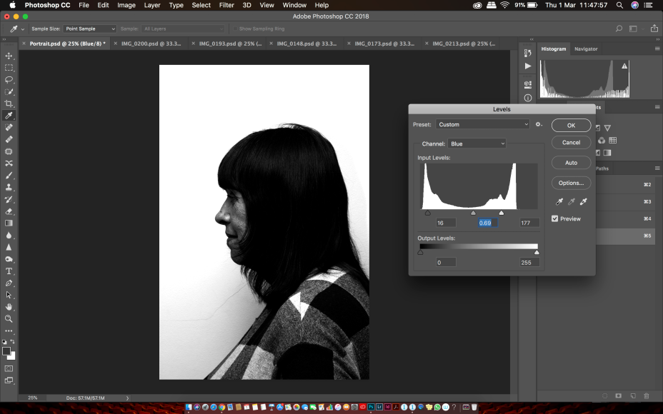 The quick selection tool can usually be somewhere to kick off, however it is usually only a starting point. You could select channels which is located next to layers. There the image is broken down in monochrome representation of RGB. This can lead to much more accurate use of selection tools.
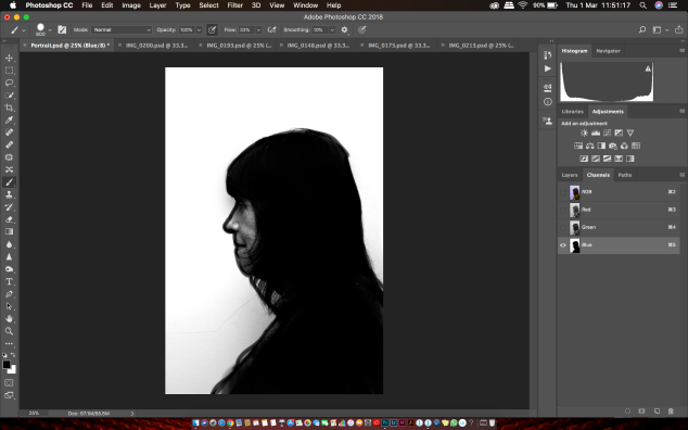 After this you can draw a silhouette of the face and mask it to cut it out from the background.
 Another tool which can be used is the Lasso tool. This is a tool which requires a fair bit of practice and experience because you can only make a selection in one go. There is the magnetic lasso but unless you have an image of high contrast it won’t work. Then you use the
  “Select and Mask” option with the “Refine Edge Brush Tool” to brush parts of the image back in. There are numerous viewing modes to help you.
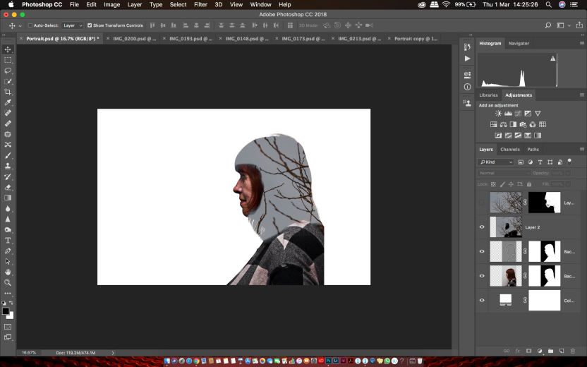 So now I’m in the process of comping my image over the portrait. This was much easier than I expected.
 Next was getting the branches to coming off of the face to make them look like hair. This is done by duplicating the overlaid layer [cmd+J] With the duplicated layer having it’s blending mode set to Normal.
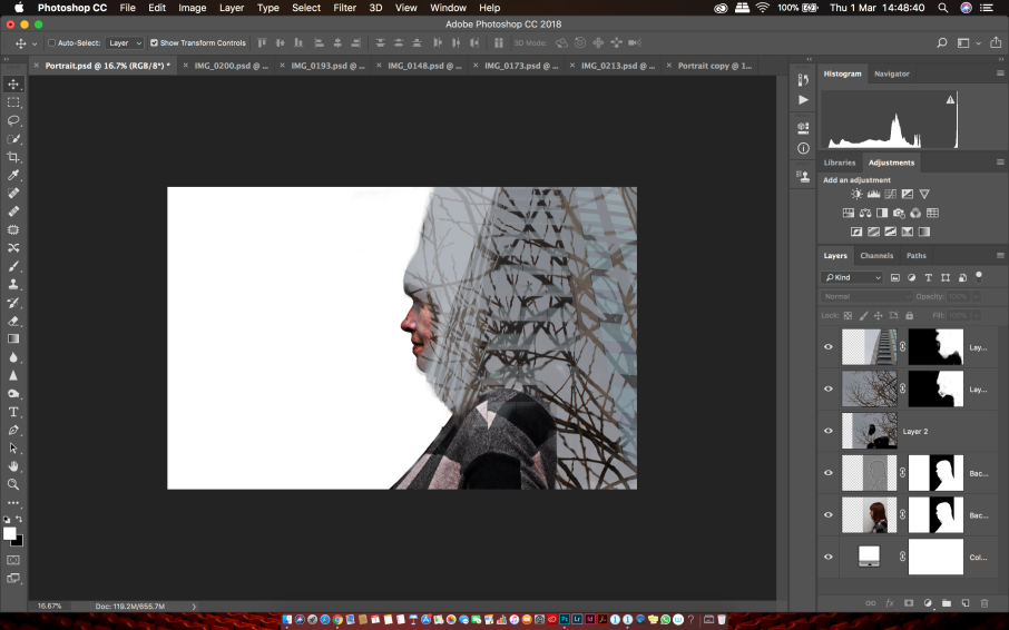 Next I added another image to portrait. This time an image of the hotel at the O2. I felt this contrasted well with the branches. The straight lines complimented wavy branches.