Evaluation for River Thames
What Went Well:
- New Skill
This was my first time producing a video, albeit only a 30 second one it was still a new skill for me to learn. I obviously knew planning a video shoot was different from a photo-shoot and this task showed me just how different it is.
Using Adobe Premiere was also a new skill.
- Public Awareness Campaign
This task gave me an insight into public awareness campaigns. However I feel there was still a lot more to learn, I think more research would’ve made my idea generation a lot easier.
- New Sport
Photographed rowing which is a sport I’ve never really been interested in and my lack of understanding did kind of show when speaking to the London Rowing Club but I finished the shoot with a good relationship with them and it could lead to more work in the future. After I shot the video and they were made aware of my sports photography background, they asked me to come and take some pictures at the Head Of the River Race and these shots actually became part of my submission.
- Big Challenge
Shooting for a leaderboard was incredibly challenging. It was a lot more challenging than I anticipated. I think it’s fair to say that I did confuse the leaderboard with the 96 sheet billboard and I forgot about the lack of room. However, I am still pleased with the imagery I’ve used
- Getting Permission
This was the first time where I’ve had to ask permission to shoot somewhere
Even Better If:
- Wider Choice of Photography
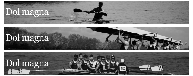
 I didn’t really have a wide range of images to choose from in the end. Out of the 11 layouts I made from the 3 days of shooting. There were images that simply didn’t work because of how small a leaderboard is, there was also some imagery that was repetitive or not engaging.
I think I would’ve had more imagery if I printed out the leaderboard and had it in my bag. I was considering printing the leaderboard to the size of my cameras LCD screen and putting it up against to act as an in-camera overlay tool but I never got round to making it.
- My Video
I’m not overly impressed with the video that I created. It was my first time but I feel I could’ve done a much better job. I’ll be honest, with this task I was just ticking the box, I wasn’t feeling passionate about my work.
In this task, there were two other students that did rowing and seeing their videos made me realise the opportunity that I had just missed.
- More Planning
I think it’s fair to say my preparation could’ve been a lot better. I’d only settled on rowing four days before sign off so this meant that I was rushing around on the final week doing recces and trying to find a location that would be willing to help me with my project and because I shot it very much on the spot, I could only use basic equipment and natural light.
- Grey Cards
I didn’t shoot any grey cards for my images. I didn’t think they were necessary because I wasn’t doing any mixed lighting element




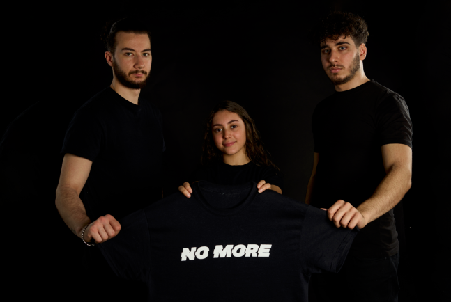 Julian agreed with what I said about the Facebook image I need to give the subjects more breathing room and I need to bring the word No More higher into the frame.
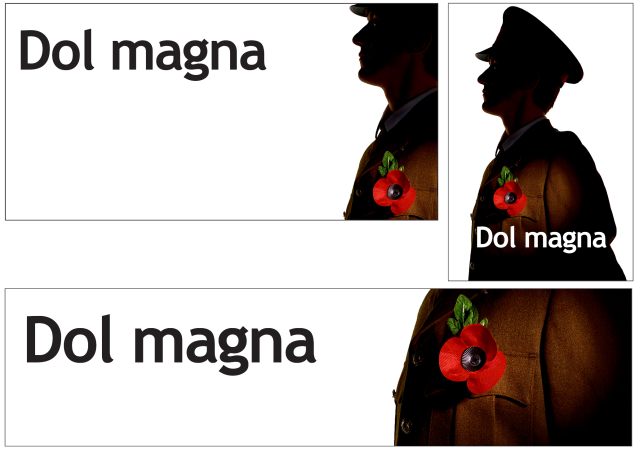 Finally, we discussed my Billboard, which I’m putting most hope into, it is without a doubt my strongest assignment in ITP, but then again there isn’t really much competition from River Thames or Music Industry. After much debate and jumping backward and forewords, I came to a decision for my hero shot. It was different from the one I chose for the AoP awards. Julian liked it, he said that the side angle does the style the most justice. When Luke was shot straight on, the style could be perceived as contemporary. it could be a modern officer at the cenotaph.
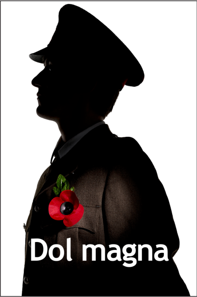 I also asked Julian about a variant of the layout. Following on from POCP, I went back and masked the Poppy and leaf again, this time I used Auto Mask. I then inverted the mask and desaturated everything but the Poppy. It does feel like colour pop but Julian agreed with my thoughts of how this adds to the narrative of remembering those who have died.
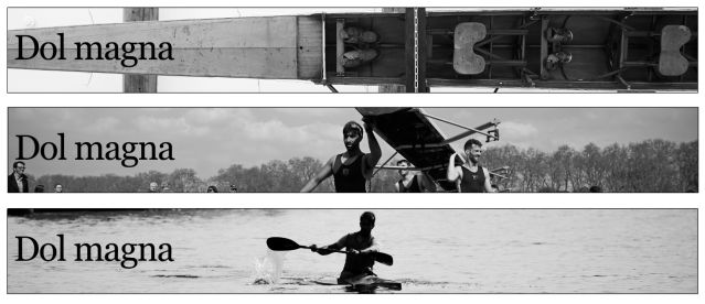
 On the left is the leaderboards I have made so far out of three days of shooting.


 All the clips are put into black & white and have a Brightness & Contrast adjustment.
 There are even two clips where I’ve had to use keyframes because of a change in exposure.

 On Tuesday I went back to the London Rowing Club in Putney. This was just for me to discuss my idea with the people at the club. I decided to take my Canon 5D Mk.IV with me because I thought I could at least get the photography aspect done however in hindsight, I should’ve taken my tripod with me because I could’ve done my video there.
 This is because my idea really underwent a radical change, my idea is now focusing more on the London Rowing Club itself. There are three rooms including a gym inside the club that are full of images and paintings from times gone by, names of winners are all over the walls. It a place rich with history. So thats what my PA campaign is going to be about.
 I managed to shoot the photography aspect yesterday, to which I think I’m going to reshoot the image of the frames but the image of the shell on the ceiling and the one of the rowers on the Thames are set to be used. The latter needs some retouching as the rower has got Dulwich Rowing on her jacket. I might try to remove the boats as they are distracting but this might be too tough.
 This is the estimate that I will propose for my River Thames Rowing Project tomorrow.