Today I’ve been on a journey of discovery as I’ve been exploring the Nix filter collection in Adobe Photoshop. It is a piece of software that houses and range of filters that range from semi-professional to professional. Most of them really feel like Instagram but if used professionally and with patience they can actually do a really good job and establish a style within your images.
The filter set that we primarily worked with is Color Efex Pro and Silver Efex Pro. Dfine can be good to use if you need to reduce noise in an image. HDR Efex Pro is what you expect.
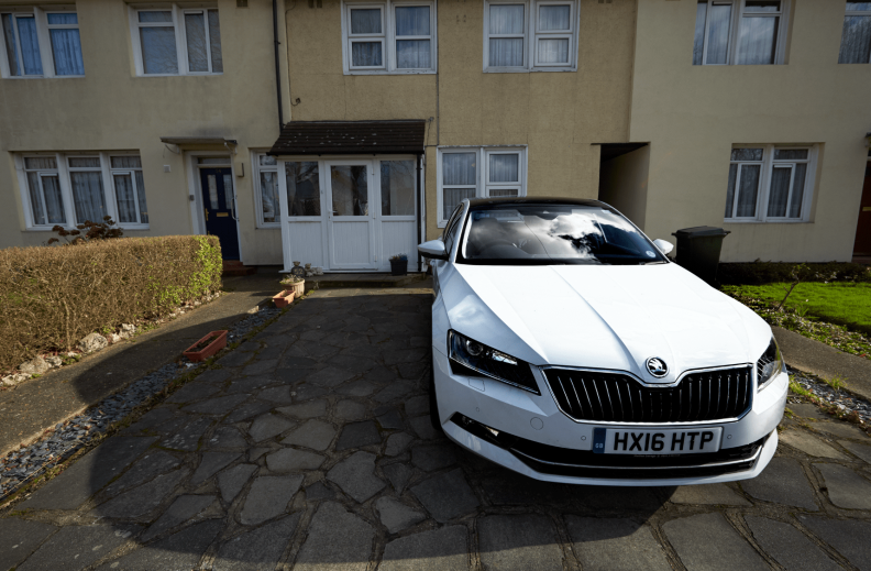
I decided to start my exploration using this image of my Dads car that I shot for the Car Comp project. I felt this would be a good image to experiment with because of the range of shadows and highlights.
I started off by using the Tonal Contrast [strong] I felt this gave the car a bit more punch and lifted it from the background. I also applied an invisible layer mask and painted just the car back in. I did this with my Wacom which I’m slowly gaining confidence in using it.
After this I decided to apply another filter. This time I decided the Midnight filter. When I first saw it in the Nix collection I wasn’t sure what I could do with it. It just seemed like the detail in the layer were completely lost. However I remembered that the filter was applied with a new layer and I could create an invisible layer mask and brush the previous layer in.
So I create an invisible layer mask and decide to brush the car in. Now the car really stands out, however the background is still pretty much lost. So I decided to set the opacity at 50%. I liked how this made the brought the back but still makes the car stand out a tad more.
For my car comp project I have attempted to comp these two images together.
Chris said that the perspective is right however he felt that I should either flip the car or the background to put the car on the road.
Which isn’t what I was initially going to do. I was gonna have the car parked on the grass on the edge of the road.
Next I cut the car out using the Pen Tool in Photoshop. I’d purchased a graphics tablet which I was hoping would make it easier to cut out. However it was tough to use, it’s something that will take a fair bit of practice to get it right. So I played it safe and used my mouse. There were a few areas done with the tablet, but around 90% of the car was cut out using my mouse.
After this I had to trace the shadow to paint it black. This was relatively easy because didn’t have to be precise like the car. Just as long as I went in the same direction as the shadow it should look plausible.
So comped into the landscape I got to this point and I felt I was finished. However Chris felt I could and should go further.
Chris copied and pasted the background and flipped it. He then masked the two layers together to place the car in the middle of the road rather than on the curb.
Chris also recommended that I look at this video and add a fake sun to my image.
Today I went to Southbank to see the Andreas Gursky exhibition at the Hayward gallery.
Rhine II. 1999. Remastered 2015
I had some prior knowledge of the work of Andreas Gursky. I really liked his Rhine II image. I really like it how post-production can make such a big difference. In the original image there was a power station and a few boats. But this has been manipulated and overlaid so well that there is no way of telling.
99 Cent. 1999. Remastered 2009
I’m also aware of his 99 cent image. I really like the lines of the image. However I didn’t realise that this is a composite photograph. I thought it was natural. Once again it has been stitched together so well.
I also didn’t know about the back story of this image. This was taken in a 99 cent store. It provides us with “instant gratification”
Tokyo Stock Exchange. 1990
One image from the exhibition I really liked was of the Tokyo Stock Exchange in 1990. Gursky took this image inside the stock exchange and it would appear he had a shutter speed of probably a 1/60. This had led to motion blur. I feel that this was done to show the hustle and bustle of the stock exchange. This picture was taken during the Japanese asset price bubble of 1986 to 1991. It was a time of inflation so the motion blur could be panic & confusion.
It turns out there is another reason for the motion blur. “creates an image without central focus … rather than capturing a decisive moment, Gursky’s approach incites our eyes to wander and drift”
I’ve just got back from my car comp shoot. I decided to shoot on Blackheath Common. I did this shoot on a Canon 1D-C and a 16-35mm that I borrowed from CLR. Other equipment included a set of QP cards and my bog-standard tripod. I wasn’t able to find my ND filters however there virtually wasn’t a cloud in the sky so I couldn’t think of any use from them.
I have got all the shots uploaded onto Capture One and backed up onto my hard-drive. I’m now in the process of editing them down for Tuesdays lesson where I will be comping two of them today.
With my car comp project I’ve had some really good ideas which I’ve been struggling to portray in sketches. So I’ve been using Forza Horizon 3 to portray some of my ideas.
Below are a few of my initial ideas portrayed through Forza. The thing I struggled with most was drawing perspective. It was tough to draw a 45 degrees off of the car as it was going down a long road. However with the photo mode in the game I just have to set up the composition and shoot away.
Yesterday I did a blog post where I shared a few sketches that I did for my car comp project.
This is the image that I would like to replicate the most but I was struggling to show this with a sketch.
However when I was thinking about it, I remembered back to a game I played a few years back. Forza Motorsport 3. I could remember it’s tv commercial. I really liked this shot and I would like to do it for my car comp project. I really like the use of lines pushing on to a location to drive to, which could be anywhere.
Even though it’s not the New Forest, I’m going to be going to Blackheath tomorrow where I’m hoping to shoot the background or at minimum use it as a test shoot for if I have a chance to visit the New Forest.
This is the first sketch I had for my urban setting. I was thinking of Greenwich, specifically Cutty Sark. Where in the background there would be a view of the entrance to the Greenwich foot-tunnel and Canary Wharf.
A 2nd idea I had, once again with Greenwich, this time with the alley ways going through the Greenwich’s housing. This would be looking straight into the car. Using the straight lines of the street to provide an image which is nice to look at.
Now with a rural setting. This one was tough to sketch. I however this could be my strongest idea at the moment. I think this image would be very reminiscent to car advertising. A big wide establishing shot showing the car in it’s surroundings. This case, the 4×4 Skoda Superb in the countryside.
A final rural idea that I sketched was of a much more simpler rural idea. My dads car is Candy White and that would provide a very nice contrast with the darker colours of the forest. The car could be going for a drive through the rural landscape.
I’ve decided to do some research into how Skoda advertise there range of Skoda Superb cars. I know that this task isn’t about the the car, we’re not doing an ad campaign. However I feel it is important to look at where they like to comp the car into. The Superb is 4×4. So Skoda probably use rural areas like countryside for their advertising.
This slideshow requires JavaScript.
I would like to set my shoot around a rural setting. I feel I could do more with an rural setting. During the week I’m hoping that me and my Dad can take the car down to the New Forest which has got a nice variety of wide open spaces and closed in forests.
There are also a few small villages which could also provide a nice setting. However if I don’t have a chance to go there. I’m gonna have to base my shoot around an urban setting. Which I thinking about Greenwich.
I’ve decided to do a very quick two part comp test for my project. This test involved very simple shots of my Dads Skoda Superb and the road we live on.
This was a test of perspective. I just want to see if I can get the same perspective between two simple images before I move on to angles that the car should be shot from.
Before I show any of them. I’m just going to say there is still a lot of improvement to be made in these, but I feel I’m heading in the right direction with some of them. Also the car could do with a good wash before it’s used for the shoot.
Also the number plate has been quickly censored for security reasons.
Test 1: Low Angle
I think this is the best test shot. However the car was cut out very quickly, thats why the roof is practically gone. The other problem is the shadow. I just put together a very quick shadow so the car didn’t look like it was floating in the air. However I feel this is a decent start. Low angle seems to produce a nice shot which emphasises the scale that the Skoda Superb has.
Maybe if this was one of my attempted shots, I would shoot closer the curb.
Test 2: Straight On
For the 2nd test, I simply shot straight on into the car. In my eyes, this doesn’t work. It has potential but unfortunately there is a long way to go before this shot is correct. With this shot I only seem to be able to make the car either too big or too small. Maybe the background is just too tough to work with.
Test 3: Side
I feel that this one is well off the mark. The scale is completely wrong.
After these attempts. I referred back to the photo looking straight into the car. I remembered an image I took back in Greenwich which I felt could potentially work. it’s tough to explain but I think the perspective coherence between the car and thee background is good. However I think the angle that the car has been shot at might be slightly wrong.
I’m going to do some research into Skoda Superb’s billboards and photograph campaigns.
I thought I’d start this post with a quote from Tom Miles
“The cameras never lie, but us photographers are a bunch of lying bastards”
When I became aware of just how much composite photography is used especially in commercial photography I’ve started to agree even more with this quote. I really took it for granted just how much goes into a commercial image. I mean this take this Toyota advert on the left. There is no way that this is one image. When shown this I thought there are five different elements for this shot. I suspected that the elements were: The car, the background [bridge being editing in post], the people, the dog and the paper.
However upon further analysis and a talk there could be between 12 and 15 elements in this one image. They are as follows:
The Background
The Sky
The faint fountain in the far distance
The mountains just behind the bridge
The bridge is either A.edited or B. faked with CGI. But cgi was definitely used.
The car
The dog.
The person at the car
The car on the bridge
The people on the bridge
The paper on the floor. There is probably multiple, at minimum two.
We also looked this Land Rover commercial. This one is most likely a Land Rover on a Jeti which would’ve been cut along said jeti. Then a photo would’ve been taken of the tug boat. This would most likely be our water. At the same time, the water could be provided by the image of the ship. So we’ve got three elements. The ropes would’ve been created in post so thats five elements. The clouds are probably separate so 6. Seagulls make it seven. Then finally on the middle right of the frame we can see a small town. This is very common in commercial car photography. This is to set a vague location which could be anywhere.
We also looked at this Range Rover commercial. This car was most definitely shot in a studio. The motion blur has clearly been applied to the entire road which would be much easier to achieve if there is no car in the shot. Very interestingly, this advert can be flipped. So it can be used in both left-hand and right-hand drive countries. This is another thing which I’ve taken for granted even since I started photography.
So back to the quote earlier. We are able to fool clients and viewers into believing that everything was shot in the same place.
Chris Frazer-Smith
We we’re lucky to also have a look at this Samsung Advert. Chris shot this advert we we’re given a chance to look at the .psd file for the final image. There were around 150 layers just for this one image. That was just image files. Thats not counting adjustment layers. Every single subject in front of the man on the sofa was shot individually with a Canon 5D Mk.iii the foreground character and background image was shot on a Phase One. I think that viewers will look at this image and not care about the fact that this would’ve taken weeks of planning and even longer shooting and composing. But they’ll praise the commercial for being catching and promoting the television. If this technique wasn’t used, maybe the commercial wouldn’t have been as good or eye-catching.
Next we went out and started shooting to create our own composite photograph. These are what I settled for.
Cutting out the seats was a very fun and tough experience. It took a bit of time to get my head around the pen tool but when I got my head around it, cutting out the object was pretty simple. I however had to avoid cutting the shadows out because they weren’t defined enough. So I had to fake the shadow.
I must admit I did get the perspective and scale slightly wrong but I feel I made a good start and I’m feeling more confident about my car comp project.


 Today I’ve been on a journey of discovery as I’ve been exploring the Nix filter collection in Adobe Photoshop. It is a piece of software that houses and range of filters that range from semi-professional to professional. Most of them really feel like Instagram but if used professionally and with patience they can actually do a really good job and establish a style within your images.
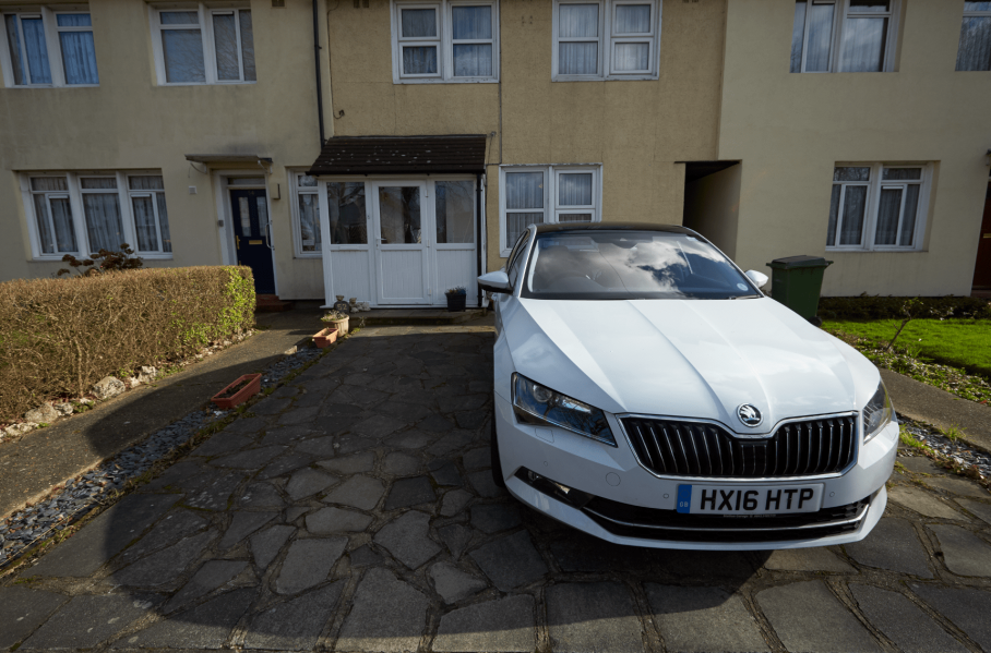
 I started off by using the Tonal Contrast [strong] I felt this gave the car a bit more punch and lifted it from the background. I also applied an invisible layer mask and painted just the car back in. I did this with my Wacom which I’m slowly gaining confidence in using it.
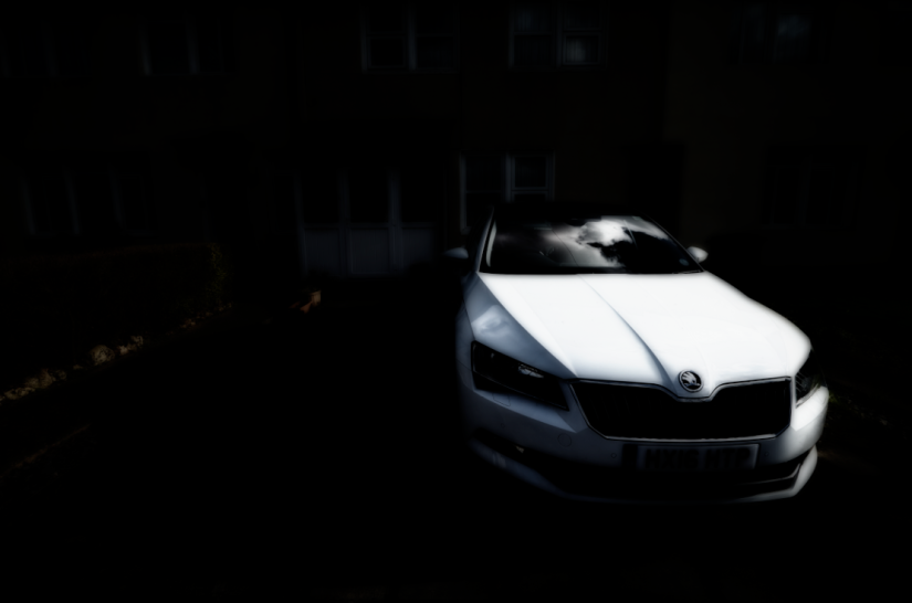 After this I decided to apply another filter. This time I decided the Midnight filter. When I first saw it in the Nix collection I wasn’t sure what I could do with it. It just seemed like the detail in the layer were completely lost. However I remembered that the filter was applied with a new layer and I could create an invisible layer mask and brush the previous layer in.
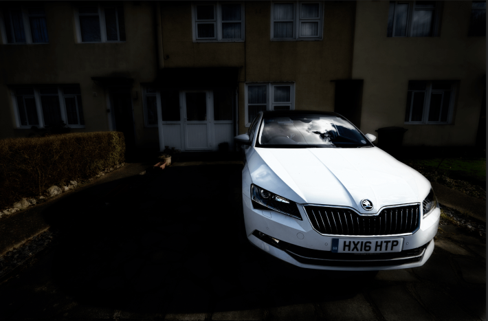 So I create an invisible layer mask and decide to brush the car in. Now the car really stands out, however the background is still pretty much lost. So I decided to set the opacity at 50%. I liked how this made the brought the back but still makes the car stand out a tad more.
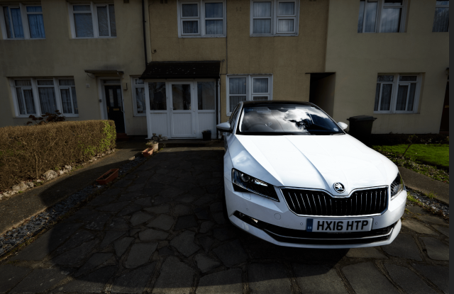


 For my car comp project I have attempted to comp these two images together.
 Next I cut the car out using the Pen Tool in Photoshop. I’d purchased a graphics tablet which I was hoping would make it easier to cut out. However it was tough to use, it’s something that will take a fair bit of practice to get it right. So I played it safe and used my mouse. There were a few areas done with the tablet, but around 90% of the car was cut out using my mouse.
 After this I had to trace the shadow to paint it black. This was relatively easy because didn’t have to be precise like the car. Just as long as I went in the same direction as the shadow it should look plausible.
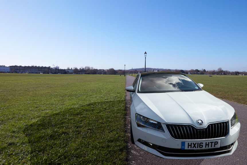 So comped into the landscape I got to this point and I felt I was finished. However Chris felt I could and should go further.
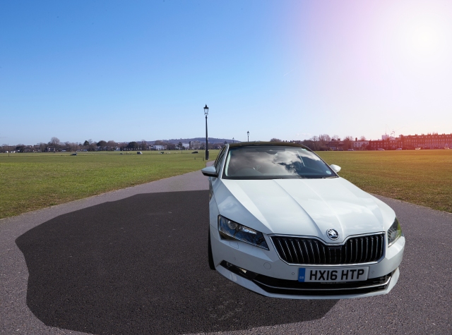


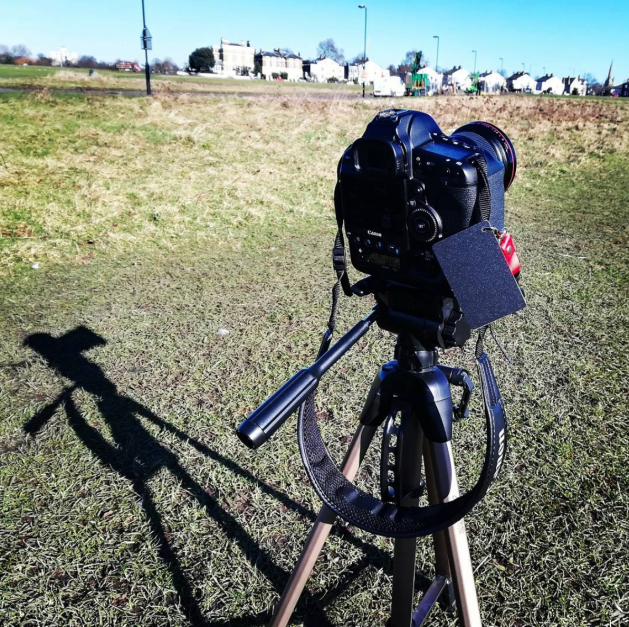 I’ve just got back from my car comp shoot. I decided to shoot on Blackheath Common. I did this shoot on a Canon 1D-C and a 16-35mm that I borrowed from CLR. Other equipment included a set of QP cards and my bog-standard tripod. I wasn’t able to find my ND filters however there virtually wasn’t a cloud in the sky so I couldn’t think of any use from them.
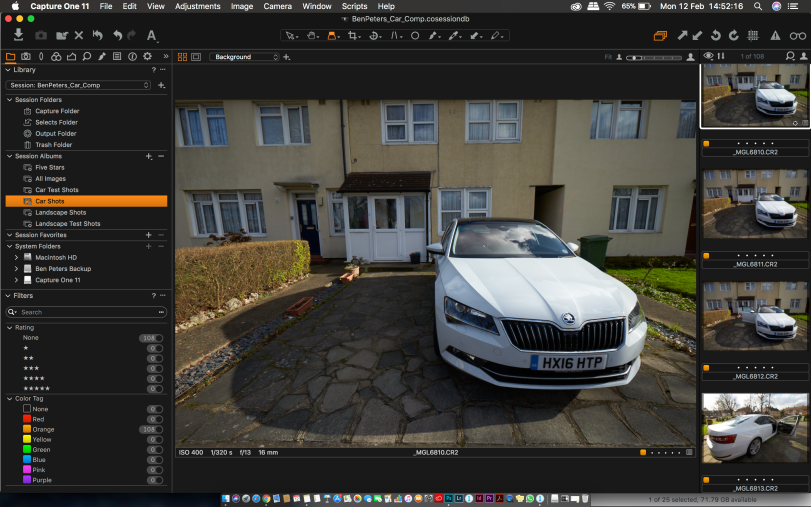 I have got all the shots uploaded onto Capture One and backed up onto my hard-drive. I’m now in the process of editing them down for Tuesdays lesson where I will be comping two of them today.

 Yesterday I did a blog post where I shared a few sketches that I did for my car comp project.
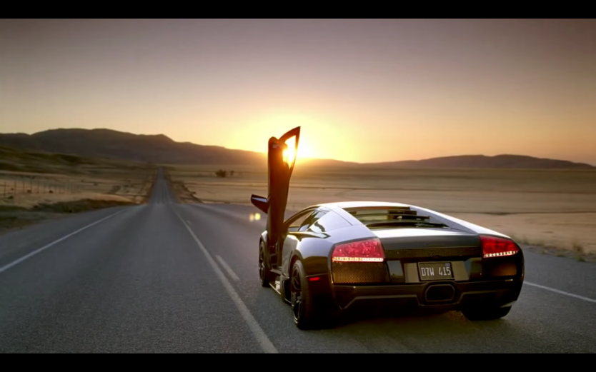 However when I was thinking about it, I remembered back to a game I played a few years back. Forza Motorsport 3. I could remember it’s tv commercial. I really liked this shot and I would like to do it for my car comp project. I really like the use of lines pushing on to a location to drive to, which could be anywhere.
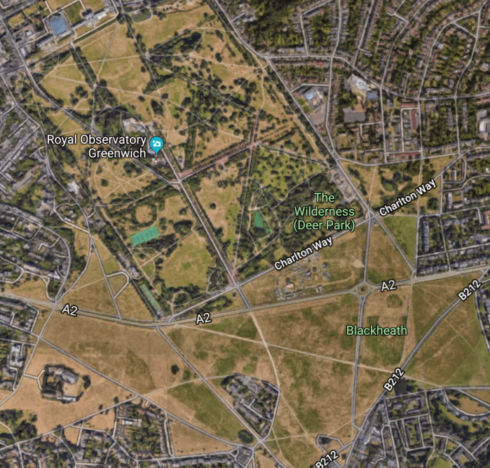 Even though it’s not the New Forest, I’m going to be going to Blackheath tomorrow where I’m hoping to shoot the background or at minimum use it as a test shoot for if I have a chance to visit the New Forest.
 This is the first sketch I had for my urban setting. I was thinking of Greenwich, specifically Cutty Sark. Where in the background there would be a view of the entrance to the Greenwich foot-tunnel and Canary Wharf.
 A 2nd idea I had, once again with Greenwich, this time with the alley ways going through the Greenwich’s housing. This would be looking straight into the car. Using the straight lines of the street to provide an image which is nice to look at.
 Now with a rural setting. This one was tough to sketch. I however this could be my strongest idea at the moment. I think this image would be very reminiscent to car advertising. A big wide establishing shot showing the car in it’s surroundings. This case, the 4×4 Skoda Superb in the countryside.
 A final rural idea that I sketched was of a much more simpler rural idea. My dads car is Candy White and that would provide a very nice contrast with the darker colours of the forest. The car could be going for a drive through the rural landscape.
 I’ve decided to do some research into how Skoda advertise there range of Skoda Superb cars. I know that this task isn’t about the the car, we’re not doing an ad campaign. However I feel it is important to look at where they like to comp the car into. The Superb is 4×4. So Skoda probably use rural areas like countryside for their advertising.
 I’ve decided to do a very quick two part comp test for my project. This test involved very simple shots of my Dads Skoda Superb and the road we live on.
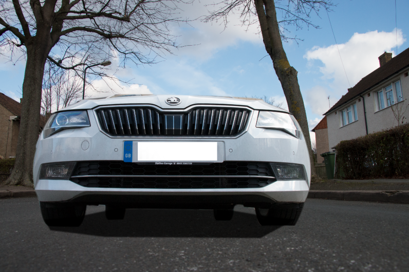 Test 1: Low Angle
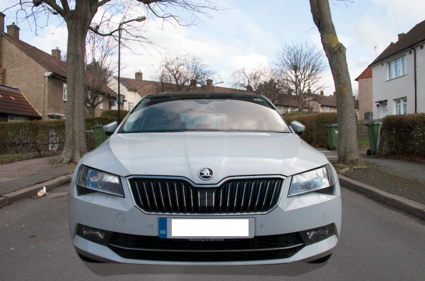 Test 2: Straight On
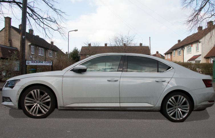 Test 3: Side
 After these attempts. I referred back to the photo looking straight into the car. I remembered an image I took back in Greenwich which I felt could potentially work. it’s tough to explain but I think the perspective coherence between the car and thee background is good. However I think the angle that the car has been shot at might be slightly wrong.
 When I became aware of just how much composite photography is used especially in commercial photography I’ve started to agree even more with this quote. I really took it for granted just how much goes into a commercial image. I mean this take this Toyota advert on the left. There is no way that this is one image. When shown this I thought there are five different elements for this shot. I suspected that the elements were: The car, the background [bridge being editing in post], the people, the dog and the paper.
 However upon further analysis and a talk there could be between 12 and 15 elements in this one image. They are as follows:
 We also looked this Land Rover commercial. This one is most likely a Land Rover on a Jeti which would’ve been cut along said jeti. Then a photo would’ve been taken of the tug boat. This would most likely be our water. At the same time, the water could be provided by the image of the ship. So we’ve got three elements. The ropes would’ve been created in post so thats five elements. The clouds are probably separate so 6. Seagulls make it seven. Then finally on the middle right of the frame we can see a small town. This is very common in commercial car photography. This is to set a vague location which could be anywhere.
 We also looked at this Range Rover commercial. This car was most definitely shot in a studio. The motion blur has clearly been applied to the entire road which would be much easier to achieve if there is no car in the shot. Very interestingly, this advert can be flipped. So it can be used in both left-hand and right-hand drive countries. This is another thing which I’ve taken for granted even since I started photography.

 Next we went out and started shooting to create our own composite photograph. These are what I settled for.