Evaluation for Billboard

What Went Well:
- The Imagery:

I am very happy with the single image I have produced from this shoot with my great team that comprised of Molly Percy as Digi Op and Tiana Lea as a lighting assistant. I feel the image is very strong as a stand-alone portrait and it works very well in the layouts. Maybe it could’ve been a tiny bit better in the 48 sheet but this image has been composed in three unique ways but still feels cohesive. I think it’s fair to say this is definitely my strongest image from my Images That Persuade submission. It is probably very well the strongest work I’ve shot to date. I am definitely very proud of it, I just wish my nan was here to see it because she turned me towards the Poppy Legion when I started to tsje an interest in the military. I’m also proud of the fact that I was basing my shoot around this idea of remembering those who gave their lives, seeing on how the First World War centenary is still fresh in our minds thanks to productions like Peter Jacksons They Shall Not Grow Old
- The Subject:

Asa Butterfield in Journeys End [2017]
I had two subjects for the shoot, one of which was the actor Luke Ward-Wilkinson to be the Tommy and I think it was quite a coup to get him involved. I think the tutors were definitely impressed with me getting Luke involved. Not only did the attire fit him perfectly, even the service cap I purchased whilst panicking for £30 fit him perfectly. However, most importantly, his character was perfect. He was spot on for the young lad who jumped at the opportunity to enlist to fight on the Western Front. Looking back on the shoot, I’m reminded of Asa Butterfield’s character in Journey’s End. The young British Tommy. This shoot definitely had that feeling of it was meant to be and everything fell into place.
- Style:
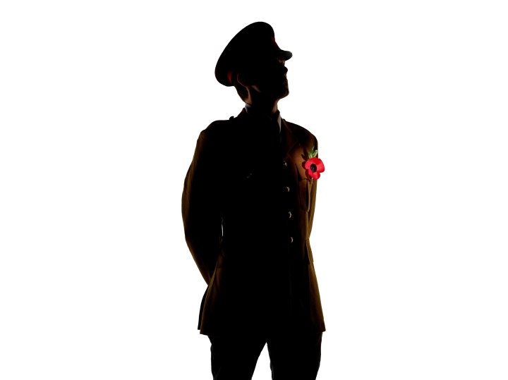
I’m very happy with the style that was achieved in the hero shot. As a recap, the style I wanted was the early First World War British Tommy. So very simple uniform and no virtually no webbing or equipment. The headwear was very important for the style and the profile shot is perfect for my intended style. I wanted this style as I wanted to take the Poppy Legion back to its routes when it was founded as the Haig Fund after the First World War.
On the note of style, I also feel the shot was poetic as well. I didn’t use the classic paper poppy for this shoot because it was too small in the frame, I also only had an ANZAC one and not a Poppy Legion one. This meant I used a much large poppy which had the feel of it was actually picked up on the Battlefield, maybe ‘In Flanders Field’ “In Flanders Field the poppies blow”
- Lighting:
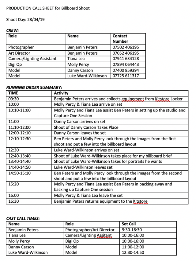
The lighting was absolutely perfect for the shoot. Funny enough it was made perfect by a mistake. I envisioned a perfect silhouette to truly make the poppy pop at the viewer. To achieve this, I would’ve needed a bigger studio as I would’ve needed a lot more separation from the background. However because Luke stood pretty close to the background, those lights started to illuminate the back of his neck and in a few instances, one of his eyes.

This was a happy accident that led to the lighting setup I used. We had the silhouette to be a metaphor for those who gave their lives fighting however the unintentional light brought the human factor back to the frame ever so slightly. It helped us relate to the image, a normal silhouette might’ve been too graphic to call it a photography campaign. The lighting also helped the composition and flow of the image which is very important in a poster campaign. Chris put it as there is a level on anonymity but there is still a human factor to the subject.
- Composition:

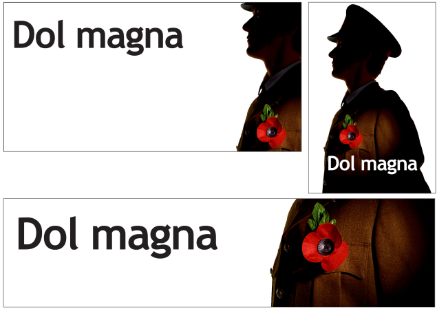
The image works really well in all three layouts. As mentioned, the 48 could’ve been a bit tighter, however it respects the golden ratio. You start on the left-hand side of the poster, you see the type, then you’ll see the glint in the eye, which is in line with the type, then the gaze of the viewer will come down to the Poppy which is obviously what this shoot is all about. I feel the 96 works well because the viewer will most likely only have 2 to 3 seconds to see it so the message has to be instant. Type, poppy, uniform and that’s it. In the 96, the type sits very nicely on the body of Luke and the entire pose is heroic.
- Financial Side:
Images That Persuade is the first unit where we saw the financial side of photography. The process of getting an estimate approved usually isn’t a quick process, there is also pro forma invoices for payment that is needed before the work can begin. This will definitely help me going forward. My final invoice is lower than my estimate because I didn’t have a make up artist or stylist for my shoot.
- My Team:
I had a very strong team behind me for this project. Not only was Molly & Tiana both fantastic in their respective roles as Digi Op and Lighting Assitant but they were also great calming influences on the day and in the build-up which was far from ideal. Molly Percy actually helped me come up with the idea of shooting for the poppy legion and her eye for detail was very helpful in getting a strong heroic pose out of the talent. I honestly could not have done the shoot without them.
- Progression
I think that my idea has progressed a lot since the concept stage where I had my brilliant drawings of the break dancing soldier. My image had definitely undergone a lot of progress between the test shoot and the final image, the model has definitely improved.
- Loads of Assisting:
A benefit outside of my shoot was the amount of assisting/digi oping I’ve done during the billboard assignment
- Bryony [Studio Beauty]
- Chiara [Studio Food]
- Tiana [Location Sport]
- Elle [Location Sport]
- Molly Percy [Studio Drinks]
This has given me a wide range of experience and learnt a lot of names
Even Better If:
- Digging myself a big hole:
I think it’s fair to say I dug myself a massive hole for billboard. I was very determined to find an actual soldier for the shoot as my outside collaboration. I think I was incredibly determined to do this to make up for the fact that I was going to do yet another shoot with a makeup artist or stylist, so seeing on how I was going to be falling short in that aspect I thought I really had to wow the tutors by trying very hard to find a currently serving member or a veteran.

However, the after effects of my nan’s death meant that I was never on the ball and I actually never started emailing places until a week before the shoot. Not only was this short notice for a subject, but this was also very short notice for legal reasons. Current soldiers aren’t allowed to wear their uniforms outside the barracks without permission and they need special approval to be used for photo-shoots. So on a whole, I left it too late and I was initially very gutted and very embarrassed. It really felt like I had over-promised and under-delivered once again. However, this meant that I had to find someone who fitted the uniform I had and most importantly, we didn’t have to go through military procedures, so I’ve come out with work that I can easily put in my portfolio and in competitions.
I think it’s fair to say I took it too seriously, I had to take a step back and remind myself that this is just a university project. I don’t need to boil myself down in the ethics of using a solider so the campaign has integrity. Let’s say if 10 years down the line the Poppy Legion hear about this and want me to recreate it for them, then yes, maybe I’ll try harder to find a solider.
- Another shoot:
The silhouette shot was an unbridled success. The lighting was perfect but a minor regret from the shoot is that I didn’t shoot some portraits of him in the attire. As I mentioned he was perfect in the service dress and I just wish I could’ve shot some normal portraits of him. However now that I’ve passed POCP, I am considering booking out a Phase Kit from Kitstore and doing a shoot with Luke another time, of course, I’m bound to change my mind when I see our timetable for next year.
- More experimentation:
I think there is another way I could’ve shot this. Lighting the poppy was a big challenge, trying to find that perfect balance between shadow and highlight proved to be very tough. Also, I had to put the snoot incredibly close to Luke to achieve this lighting set up, so close to it very nearly peaked into his wardrobe. Keeping the modeling light on was not a good idea in hindsight.
I think there is another way I could’ve lit this and it might’ve produced the true glow/spotlight effect I was hoping to achieve. I wish I gave light painting a try. A second exposure and a phone torch might’ve produced a really nice effect.
Overall, I am very happy with the work I have created for billboard. It is a project where I’ve had a lot of fun during incredibly testing circumstances. It is a shoot I will definitely look back on with a lot of pride. Yes, I will look back and wish I’d organised it a lot better.
- The Back I Used
Unfortunately, I could only shoot this on an IQ1 because the first year photographers and fashion had pinched the IQ3’s.


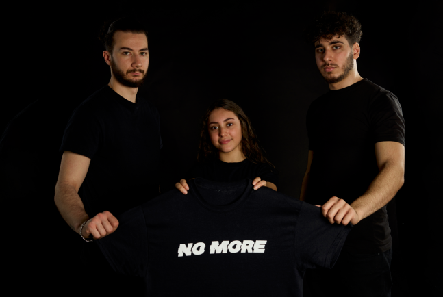 Julian agreed with what I said about the Facebook image I need to give the subjects more breathing room and I need to bring the word No More higher into the frame.
 Finally, we discussed my Billboard, which I’m putting most hope into, it is without a doubt my strongest assignment in ITP, but then again there isn’t really much competition from River Thames or Music Industry. After much debate and jumping backward and forewords, I came to a decision for my hero shot. It was different from the one I chose for the AoP awards. Julian liked it, he said that the side angle does the style the most justice. When Luke was shot straight on, the style could be perceived as contemporary. it could be a modern officer at the cenotaph.
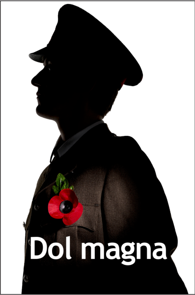 I also asked Julian about a variant of the layout. Following on from POCP, I went back and masked the Poppy and leaf again, this time I used Auto Mask. I then inverted the mask and desaturated everything but the Poppy. It does feel like colour pop but Julian agreed with my thoughts of how this adds to the narrative of remembering those who have died.
 Layout 17 is a dark horse in my billboard project.
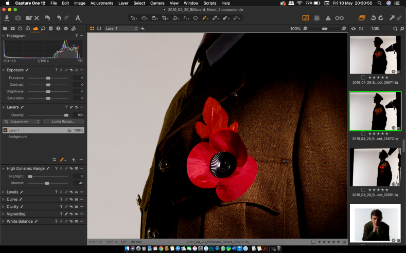 So I went back to the RAW file in Capture One and masked the leaf and then eventually the right side of the poppy which was in shade. Now I was able to lift the shadows and bring out the green.
 I think I might remove the mask from the right side of the Poppy because it doesn’t feel as 3D as it did, it feels like it was pasted. I do hope I can get the leaf to look realistic because I really like this frame in the layouts
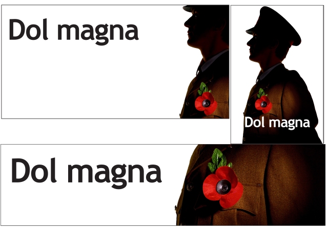


 If I had to pick one now, I think I would go with one, which is a different hero shot than what I picked after the shoot.
 Out of these layouts, my favourite one is this one. I really like the low angle, it gives a heroic feel, especially with the hands behind Luke’s back. It pushes his chest forward and makes him look like he’s standing proud. The only problem is the type on the Adshel. So I might crop that one from the waist upwards so there is more room for the type to stretch across his body and I can revert back to the white background.
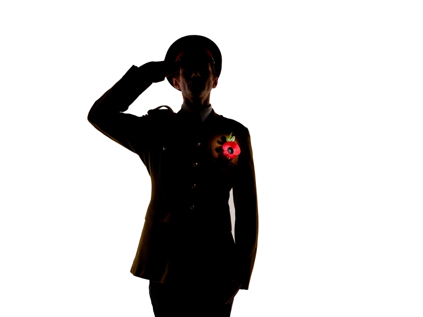 Chris felt I need to find the balance of the perfect pose and the perfectly lit poppy. He felt that Image 6 was gorgeous.
 Monday was the long-awaited billboard shoot. I was dreading it, I just wanted to get it done. It was a bit of a slow start but I think it went brilliantly in the end.
 Both of my subjects turned up. However with the first shoot, the uniform too small so I went with the black overcoat with a cap. Which did give a vibe of the remembrance service at the Cenotaph. However, I wasn’t really feeling it. It didn’t really look that good. Molly Percy spotted a potential idea with a new pose but it just wasn’t working. It also didn’t work because the Poppy felt like it was pasted on in Photoshop. This is because the shadow was always going to struggle to appear when on black attire.
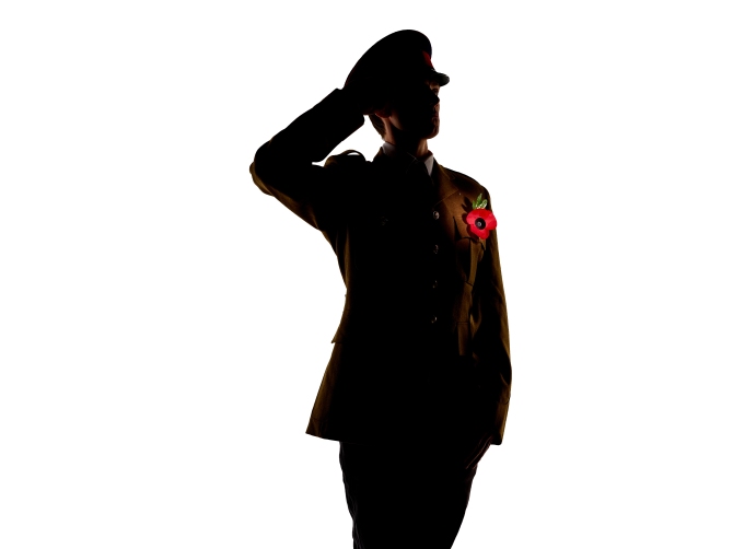 This is the hero shot in my eyes. I very quickly picked this one out from the shoot to submit into the AoP students awards which the deadline was on the night of the shoot. I really like this image because of the glint in his eye, this was a mistake on my part because Luke was closer to the background than I intended, however, It really added to the image. It made the subject human, but it kept the anonymity which was very important to signify those who gave their lives. I really like the pose, it’s proud, it feels heroic, it feels like a British Tommy who is about to lead his men over the top and into No Mans Lands. Below is a contact sheet: