

Don Mccullin
 There is one name which has been mentioned a lot by both Julian Hawkins & Chris Frazer-Smith. As this project is all about images that persuade the name Don Mccullin has been mentioned a lot. I’ve booked tickets to go and see his exhibition next week, in preparation I’ve decided to rewatch the documentary McCullin.
I was lucky enough to see this at Somerset House when I was studying foundation.
I really like what McCullin says as the start of the documentary, it is simply McCullin speaking the truth of what he documented.
“War is partially madness, mostly insanity and the rest of it schizophrenia”
“You do ask yourself, why are you here, what is my purpose, what’s this got to do with photography, it goes on and on the questioning, you’re trying to stay alive, you’re trying to take pictures, you’re trying to justify your presence and you think what good is this going to do, these people have already been killed”
“There were many major battles within my own mind before I got to these major conflicts and when I got there I was even more confused”
“I tried to stay calm, I try to not indulge myself in this picture taking, it was something I was meant to do, but how far was I allowed to take it”
“It was a lot of hypocrisy spinning around in my own mind at the time, I didn’t really think it was right to be there, cause I sometimes felt that the people who were doing these terrible things, thought that I was ‘ok’ing it, of which I certainly wasn’t”
 The documentary opens with McCullin talking about the first execution he photographed. It was of someone who planted a bomb in the Saigon market. He was shot at dawn by a firing squad and the officer went over, grabbed him by his hair and shot him through the head. McCullin stood there with his mouth wide open and he heard a man shout “God that was great stuff did you get it” Don didn’t get an image of this execution and he never told people at the Sunday Times because he didn’t want the paper to think that he was an amateur to of been there and not got an image to show for it. He questioned if he ever had the right to take the image of that mans murder.
 Without a doubt, the most iconic image of McCullins work, maybe one of the most iconic images from the Vietnam war. It was taken during the Battle of Hue which was one of the longest and bloodiest battles of the war.
This image is so eye-catching. We are drawn into the gaze of this shell-shocked soldier that is clutching at his M16 rifle as he stares off into the distance, looking further than the camera. This incredibly dramatic expression shows a really deep personal impact that war has on individuals.
He said he dropped to his knees in front of this Marine and he took five frames where the soldiers didn’t move or even blink. The soldier probably had no idea that McCullin was there.
Don was described as unique by a US Marine because he unlike the other correspondents decided to live and interact with the soldiers for many days. I guess he wanted to get to know the soldiers so it didn’t feel like he was using them to document an atrocity. “He became one of us” He also put himself in danger to get wounded Marines to safety so they could be evacuated, most photographers would’ve instead photographed the bodies. I also like on how the documentary includes a phone call with the marine who praised McCullin he says that this soldier never turned up to reunions, so this makes us question this image further, did the soldier die in Hue?, did he commit suicide back home?, did he make a full recovery and now live a loving life in peace?
 I feel this is the perfect way of summarising how good Don McCullin was at persuading and influencing people. After spending many years documenting the British Army in Northern Ireland he felt he was the perfect candidate to photograph the Falklands War however we all know that McCullin never got that opportunity because the boat was full.
However, we can make an educated guess that the Thatcher government wasn’t prepared to risk sending Don McCullin. Sunday Times editor Harold Evans said the following:
“It was an appalling decision to keep Don McCullin off the boat on the crazy excuse that the boat was full, it seemed to be saying, your photography is so honest, so searing, so implicit with meaning, we can’t take the risk of you excessing freedom of expression”
 The imagery above is really hard-hitting and in your face. However not all campaigns have to be like this. I guess you could say that the ALS Ice Bucket Challenge was a Public Awareness campaign. Even though most people used it as an opportunity to pour ice cold water over their heads, however, it went viral, so loads of people did it and a lot of people donated, a lot of money was raised from it and it made people aware of Amyotrophic later sclerosis. In 2016, a
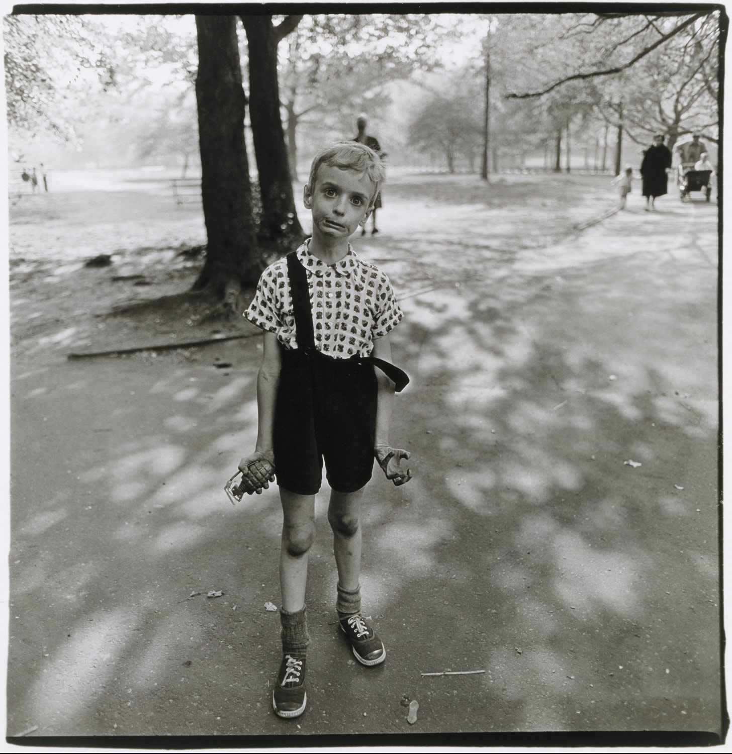 One image that really caught my mind was Diane Arbus’ image that she shot in Central Park in 1962, it is called “Child with Toy Hand Grenade in Central Park”
 One thing I loved looking it at was the contact sheet where we see that Arbus and the boy actually engage with each other as she hunts for the right angle. When I saw this image, I thought it was a snapshot of a kid who had gone insane maybe because of the loss of a father in war?
 When I saw this image pop up, I instantly knew it was of 9/11. I didn’t know who had shot it, but it was just screaming September 11 to me. There is something about the pose of silhouetted firman staring into the utter destruction in front of him.
 This is a very powerful and shocking image. This image shows an Iraqi soldier who has been burnt beyond recognition trying to escape a truck which was most likely set ablaze by American A-10 Thunderbolts on the Highway of Death in the Iraq war.
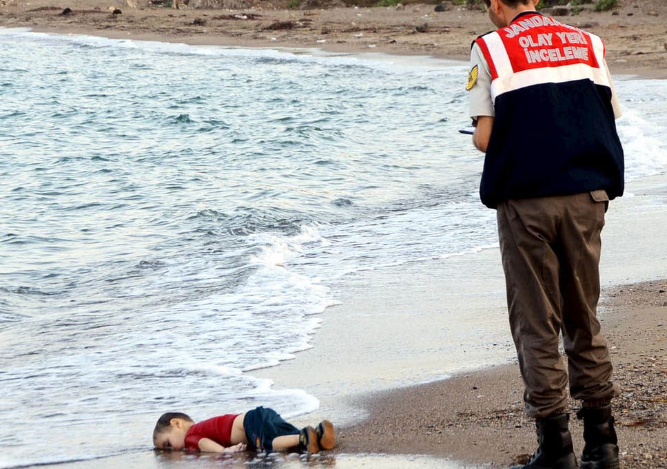
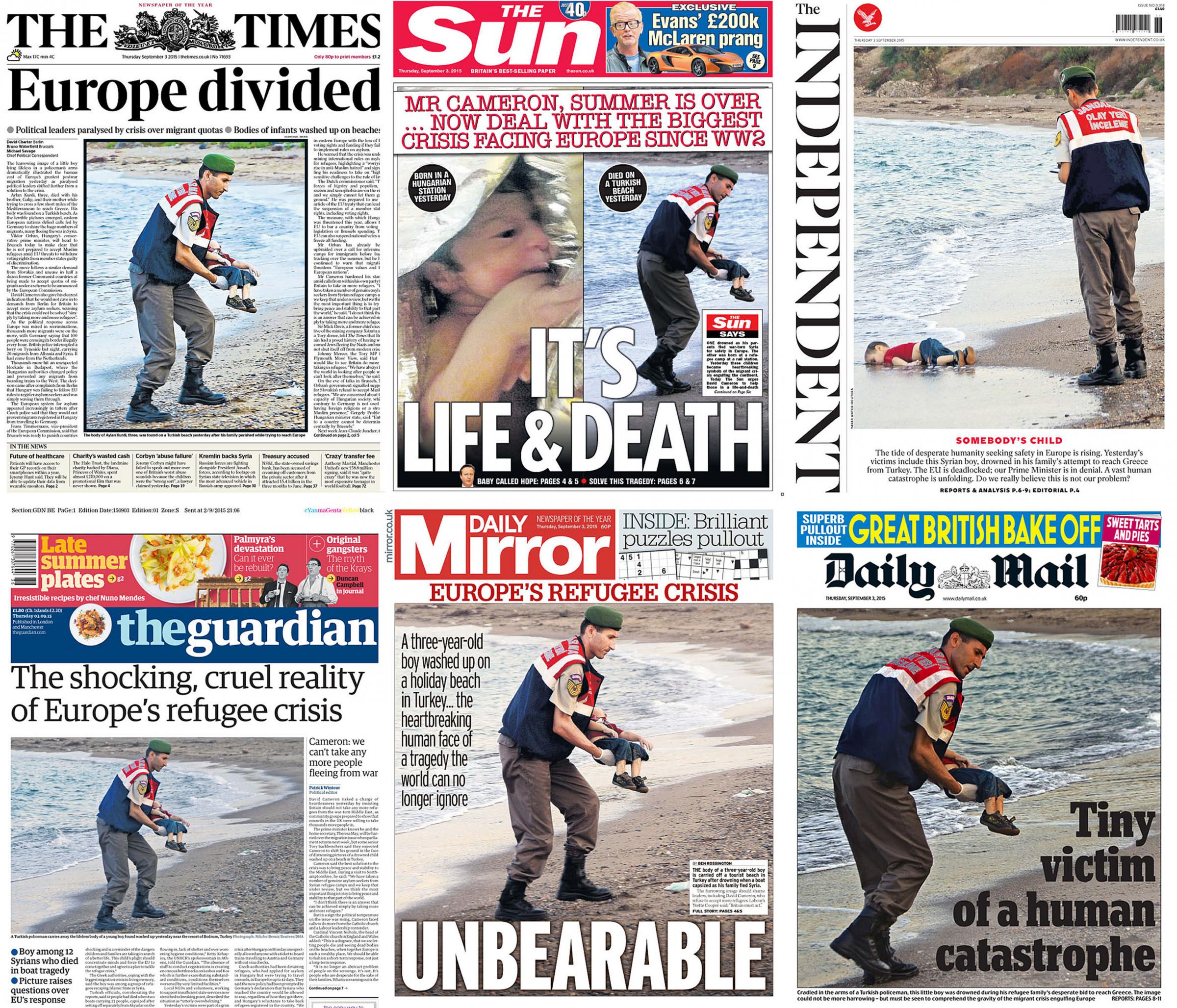 This is an image I remember being on the front covers of the national press. It was and still is, an incredibly tough image to look at. The Death of Alan Kurdi was incredibly hard-hitting because it was of a young kid who fled Syria with his family because he didn’t want to die in combat. He got out of Syria, to only drown in the Mediterranian. I also look at this image and truly question the people who think we should turn refugees away, especially when you consider that the UK has contributed to the Syrian Civil War they are trying to escape. The Independent ran the headline of
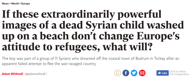

 Firstly, Chris showed us this image. It was captured in 2017 in Baton Rouge, the state capital of Louisianna. It was captured by Jonathan Bachman for Reuters. This image went viral. We can instantly work out what is happening, we can see these two police officers are about to arrest this woman. We can see the police are in riot gear so we know a protest of some form is going on and as the woman is black, we can make an educated guess that this is the Black Lives Matter movement. This image, unfortunately, is a staple of protest in the USA, ordinary people exercising their lawful & democratic right to protest and they are being arrested, essentially because they are expressing an opinion that the system doesn’t agree with.
 Regardless of whether you’re a World War One historian or a teenager browsing memes on the internet you’ve most likely come across the original or a version of this. This is one of the most iconic propaganda posters ever. It is of Lord Kitchener who was an idolized General in the British Army. This poster was done at the start of the First World War, at a time where Britain was losing more men than the Germans, so they had to recruit more men who were willing to fight for Kind & Country. This poster fit the bill, not only was his face instantly recognisable his finger followed the viewer around the room & the street. It drew people in. You could say this poster contributed to the deaths of many young British people who wanted the glory of going on a great military campaign. Remember in World War One there wasn’t much photography. Soldiers did have the Box brownie but the army’s top brass were doing there best from preventing images from making the home front. This poster persuaded people to follow the dream of being a soldier, the honor of serving your country.
 The third thing that Chris showed us was a painting. It was done by Banksy. This was done to inform us of Banksy opinion on the mess that is Brexit.
 Next Chris gave me, Izzy & Chiara two images that we had to look at and answer questions and work out how they persuade & inform us. In the first image, I felt completely out of place.
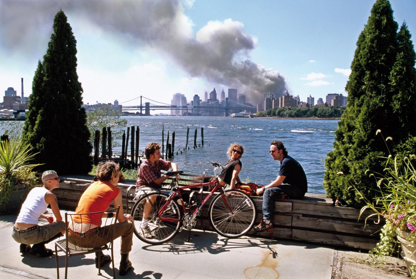 We were given an image of what is presumed to be the aftermath of 9/11. At mininum, it is after one of the planes hit the Twin Towers. This was a tough image to search. Searching up something like 9/11 skyline or New York skyline is far too vague.
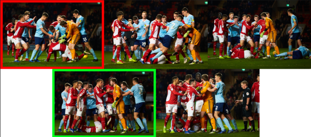
 After this, Chris asked us to present one image which we feel it good at persuading people. I instantly decided that I wanted to pick a sports image, however, I was struggling to decide what even I should show. I remembered that American Football is a new found interest of mine and I have been really invested in the anthem protests that were started by Colin Kaepernick. So I decided to look into the photography of these protests and they are all in front, showing his face, I, however, came across a truly unique image.
/cdn.vox-cdn.com/uploads/chorus_image/image/51142073/usa-today-9564783.0.jpg) This image was shot by a sports photographer called Joe Nicholson.
This image was shot by a sports photographer called Joe Nicholson. Chris loved this image, Julian loved it as well. He drew comparisons between this and the iconic image of Smith & Carlos raising their fists for the Black Power protest.
 After some initial thoughts, I’ve decided that I think I’m going to pursue a different idea to what I was intending to follow initially. I was set on shooting my WW1 project, I wanted the opportunity to shoot my personal project on Phase One. I also felt that the Imperial War Museum would be a perfect client for myself. However, after discussing my ideas with Molly Percy, who I always go to for advice about idea generation, we’ve come to the conclusion that I should do something different. I think I have now decided on a subject, I have never shot it before despite it is something I have deep in my heart, it is actually a passion I felt out after Top Gear ended, it is Car Photography.
 What car would I shoot? Well, this is subject to me getting permission from my Uncle but I would love to shoot his Aston Martin Vantage. This a concept I would have to build up from the ground because car brands that I very rarely, if ever see on billboards are Luxury British Cars like Aston Martin, Range Rover or Rolls Royce. There is loads of location & studio imagery but I can’t really find anything like a print campaign.
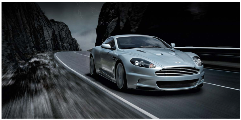 Where would I shoot it, Aston Martin tend to do there location shoots of the car in motion, usually going around a bend in the mountains or in the hills. I, however, was envisioning doing my shoot in somewhere slightly different.
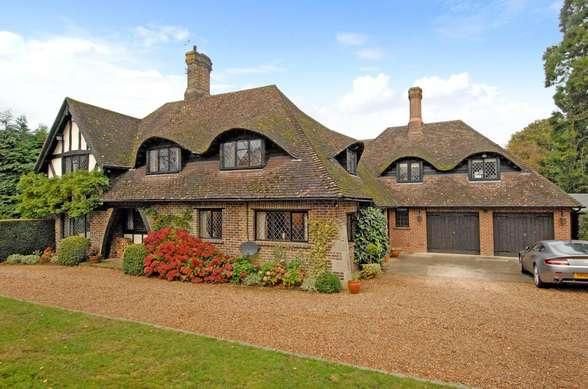 Once again, subject to approval. I would like to do it at my Uncles house in Oxted. I feel this location would be perfect for a car shoot because it seems very neutral, it doesn’t exactly scream UK which nearly all car photography ads are like so they have wide-scale appeal.
 The 48 Sheet one which caught my attention was this one of Cancer Research UK. It is typical photography you would expect from a charity. In this instance, we don’t have to see an image of a kid being upset, but our attention is caught by the fact he is smiling despite having NG tube. It is show how he is weak but he is feeling positive because of the support & research that CRUK are doing.
 96 Sheet campaigns are a bit tougher to find, off the top of my head I only tend to see them either along railways lines or at airports, usually advertising cars or airlines. However, there are one or two scattered around town. They tend to hold two 48 sheet campaigns as not every company will have the budget to go for a 96.
 There were loads of adshel campaigns. This one caught my eye as it was freezing the car in motion. When I see the motion blur I can instanly envision a car turning around a corner at speed but when I go over to look further into the poster I have to remind myself that its a photograph, it’s still.
 So firstly what is ChrnoSync. It is an application that ensures that you are truly backing up your work. When I say backing up, I mean having your Mac where you work but you two hard-drives which are cloned. This is something I’ve started to do since the start of 2nd Year. I’ve got two LaCie 4TB hard-drives that both have the 75 shoots I have done since June last year. One hard-drive is always on me and the other one is always at my Nans just up the road, in case there is a fire at my house. The one at my Nans house is a clone of the one that is always on me. I did this by simply dragging and dropping but there is a chance of significant EXIF data being lost and the files potentially being corrupted.
 I think I have come across a band that I would like to shoot for my Music Industry project.
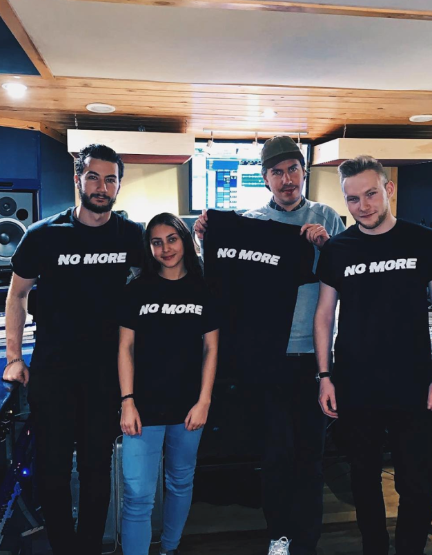 with three other musicians to record a charity single. I would like to use them because of there message about tackling youth violence in London. It is called
  I have already thought of the image I could shoot for the booklet. As there is four of them I would have to of them on either side of the cover. To of them looking straight into the camera and two of them with there backs to the camera but with their face turned towards us. This was with the shirts you will see the name No More on the front and the social media details on the back @NoMoreUk and #NoMore

 My favourite cover from the exhibition was probably Nick Cave’s The Firstborn is Dead shot by Jutta Heinglein. I like the fact the subjects face is overexposed. It really makes the cover stand out, the strong highlights is enhanced by the incredibly strong shadows.
 Another album cover I liked was Sgt Pepper’s Lonely Hearts Club Band. This is an iconic album, instantly made recognisable through its image. The image is also eye-catching cause of the strong vibrant colours that are all around the frame.
 A third one I liked was Oasis Definitely Maybe. This partially came from my recently found love for the band. But there was something about this image which really caught my eye. I think it’s to do with the variety of poses, no one seems to be engaging with each other. I really like the positioning of Liam on the floor. It is the first thing I saw in the frame.