Books and more books
Last Thursday in Location Photography we had a talk from Geraint who is a self-confessed book-junkie. He owns around 1500 photo-books. I don’t think I’ll ever reach Geraint’s level but I’m hoping to collect several photo-books myself to act as inspiration. He also believes that “the most perfect expression of photography is in print-form“. A book is also an edit for life, it’s not like a website or a portfolio where we can make changes whenever we want and our usually made on a monthly basis with a book you can’t change it once it’s printed.
Geraint also said that photo-books allow the viewer to have an intimate relationship with the photograph. With a book the viewer has full control they can see the photo as much as they want, Geraint compared it to seeing a print in a gallery, you don’t have the same amount of freedom, you may be asked to move on and you will probably have to pay to see the same image. Whereas with a book, it’s there and you may interact with it whenever you want.
It reminded me of what one of my Foundation tutors said about horror movies. He doesn’t understand why people go to cinemas to watch horror movies, they know there gonna be scared and they have no control, at least when they watch the dvd they can stop and skip, they have control there. The principle is near-amount the name for books.
 It really is a golden age for photo-books, it’s not that hard to make one and it actually isn’t tough to get your name and your book out there now, Geraint said that “more photo-books are being published yearly than ever before“. We have e-commerce on our websites, we have blurb where we can design and sell our books, we can pitch them to retailers some retailers operate on a sale and return basis, so you earn money for the books sold and you receive the unsold stock and you can try your luck elsewhere. However as always theres a drawback, there are so many photo-book that this is a very competitive market and sometimes it can be tough to think of an idea that stands out from the others.
 Next Geraint talked about some aspects of photo-books that are usually taken for granted. Firstly this is something I hadn’t given much thought for was the flow and rhythm of the book. “Different formats of photographs have different rhythms“. Landscape images are good to lead the viewer across the page and onto the next one, whereas square images don’t pull people across the page, “they are a slower experience” this does how mean that they can be used as full stops. To start and end a sequence of images. This is shown in William Kleins photo-book where he has dramatic double page spreads that pull the viewer across the page, then he ends the sequence with a square or a portrait image. This signals the end of this location or subject matter. The main thing to remember is that you need to be flexible and open to cropping when your shooting. You never really know what type of images you need until you have them all and your laying the book out.
I believe that the above image does an ok job of portraying it. Landscape: we’re drawn across the frame as we learn of new faces, whereas Portrait: we are drawn up or down to learn about new faces but we aren’t drawn to the next page. This could potentially be a problem with my images.
 Next Geraint spoke about paper-weight.
- 50-60 gsm. This is the start and is known as Bible Paper, it is very soft and the most susceptible to bleed-through. The paper with the most bleed-though is 40 gsm [tracing paper]
- 80-100 gsm. This is the type of paper that is used for newspapers. There is a very little amount of bleed-through where the images are.
- 125-180 gsm. This is print stock, this is the most common paper weight for paper that is used on the inside of a book, especially a photo-book.
- 200+ gsm. This is the wight you’d expect for a poster
- 300+ gsm. This usually used for both archive prints and for the covers of magazines and books. These weights tend to have a spring to it. Also not every book have a heavy front cover. Some do lighter covers, but the cover always to be heavier than the pages.
Pages that have a weight greater than 200gsm can’t be binded. It is recommended that you don’t exceed 185gsm but 200gsm is the highest that even the most confident book-binders are prepared to try.
 To help emphasise his case Geraint brought along some photo-books and magazines. One that instantly caught my eye was a journal called Victory. It is a publication that publishes twice a year, so once every six months. It’s online platform is updated monthly. It retails at around $16 however in the UK it costs around £20.
The journal is as the front cover suggests about the big stories in the world of sports, however it isn’t your typical statistical analysis. Victory’s website says the following “Victory provides a forum for work that is unapologetically enthusiastic and uncompromisingly human. Through extensive reporting, probing personal essays, award-winning photography, illustration, and original films and animations“. I was drawn to the magazine because of the size, a DPS is an A2 print. So there are many effect uses of double page spreads in this edition they had a very effective images of a dejected Tim Howard as he concedes and the background is full of Liverpool fans celebrating their goal. Even though the game ended in a draw, it still told the story of the game because the game was very even and deserving of a draw and Everton were very unlucky to go behind. I’d only wish I’d taken an image of it to share with this blog post.
 Mentioning another publication, I learnt something new about National Geographic.
It was one of the last magazines to convert to digital, only do so five years ago. Also to be a photographer for Nat Geo, you had to shoot on Kodachrome 25. That is why every single images that Nat Geo shared felt the same. Nowadays with everything being digital you’d think times had changed. Wrong, you can only shoot with Natgeo if you shoot with Canon. That is why there are never any Canon commercials in the Natgeo magazine. Mentioning adverts, the most expensive commercial in a magazine is the Inside Front Cover, the most expensive is the back cover.
 After this I did an edit of the most recent images for my photo-story. Geraint have us a quick insight into how an edit should go. The first edit should be on a technical level, so in the image in focus, is it well exposed, composition, is the image repeated etc. This is usually the only bit of the edit that is done on a computer.
 The next bit of the edit is where we take the viewer into account, what is the image saying?, is it saying the right message? can the viewer understand it?.
Then the final bit of the edit is the sequence, this is when the story truly comes together. It is much better to have every single image printed out right in front of you, this way you can move them around and draw comparisons and see connections.
When looking through my images, Geraint decided on the three pivotal images of my story. Left: The German leaves his trench to start the truce. Middle: The Germans and British meet in the middle. Right: The artillery bombardment singals the end of the truce and fighting must resume.
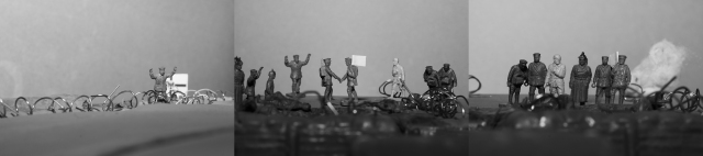
When Geraint looked at my images, he had thoughts of the classical dark black & white scenes of All Quiet On The Western Front, which was one of my starting points for this project. He also agreed with me when I decided to go with the Christmas truce rather than a battle, the truce is unique to war and unexpected. Me and Geraint also felt that these three images would work as my double page spreads, they would work particularly well in panoramic format [2.9:1]


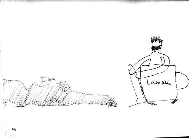
 He had the impression that it was a “ship wrecked man at sea in a cup” this is how Matt viewed the narrative going forward. To which I mentioned that I was hoping to go more along the lines of escaping from a deserted island. Chris said that he “Really liked the idea of escaping from the sinking Titanic in a coffee cup, he’s smiling in his tuxedo as he escapes whilst playing the violin” It would feel poetic when people view it, they’d probably instantly hear “Nearer, My God, To Thee” when the Titanic slipped below the waves.
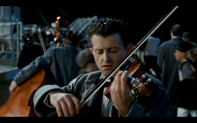 If I do go with the sink ship, I could probably show this in the attire as well for my model. Tuxedo, black suit, maybe something as simple as an overcoat could replicate a passenger or maybe even one of the violin players. If I go down the abandoned island route the model needs to have crazy hair and lots of stubble.
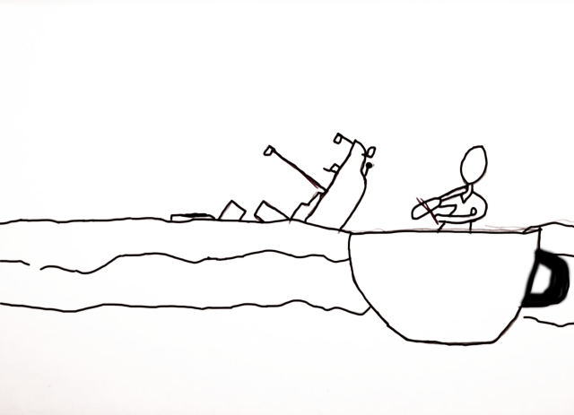
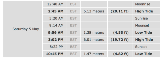
 I’m hoping to shoot the backplate on Saturday where the first location I had in was Dover. At the bottom of the cliffs there is a small beach next to Samphire Hoe. I feel this would be a very good starting point if I’m able to get onto the beach.


 For the photo-story I got two pro sticky notes.
 For the portrait project. I got one pro and one con sticky note.
 When I started doing research into photographers of WW1, the first name that I saw was that of Lt. Ernest Brooks, he has four images in the article, however probably his most famous one wasn’t included in the article, I’ve included it below, it is the reason why I want to experiment with back lighting my soldiers.
 While looking through some editions of the RPS Journal I came across a few pages that might be of some use for my photo-story project. [Lewis, 2018]
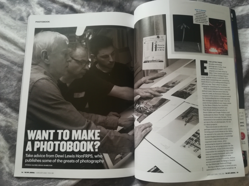 The article in question is about Dewi Lewis and how to make an inspirational photo-book. At the end, there were 5 Tips On How To Create A Standout Photo-Book. Here is what I took from the five tips.

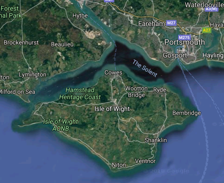 To shoot my backplate for Lavazza coffee project, I need to go somewhere on the coast where there is another island in the background. The first location that springs to mind is Portsmouth.
 So since the talk I’ve given my main idea for Lavazza coffee some thought and I’ve made a few changes which I feel, improve the narrative.