

Summer
It’s been a while since I’ve posted on my Ravensbourne blog. I’ve been taking a bit of time to take in the grades I got for Location Photography and Lavazza. I’ve also spent the summer engaging with photography. Here is a summary of what I’ve been doing.
Positives:
First World War
 A couple of weeks ago, I took time to think about my photo-book submission, A World Beyond The War. I was very happy with the story that I decided to portray. I was very happy with the execution of not only the images, but the flow of the book. I was having many thoughts about how I could take this further, I wanted to turn this into my full-time personal project. I then thought, this could be taken further if I
 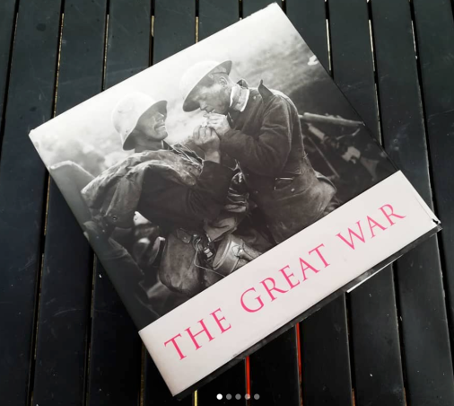 actually recreated some of the most famous images of WW1, maybe I could recreate Lt. Ernest Brooks “Anonymous Heroes” silhouettes. Another motivation for me to carry this further was the Imperial War Museum. I went back to see their First World War exhibition to get some inspiration. When prowling through the book-shop I found a book a brilliant book called The Great War: A Photographic Narrative. This is the perfect book for me to carry out my goal of re-creating famous WW1 imagery. It hold around 500 images. British documentary photographer said this about the book:
“This book is going to dumbfound people. They are finally gonna see the true scale of the sacrifice. It is not so much a book as it is a massive piece fo shameful history”
Another motivation was that the Imperial War Museum lets people submit ideas for exhibitions. Once I’ve got more imagery I’m gonna do that. Not much chance of a response but nothing to lose and everything to gain. It was then, something happened where I thought I had to continue this project. I got an A+ for my photo-book.
Secondary School
 I’ve been back to Thomas Tallis to help my old Photography teacher cover a few events. These two shoots included the Yr.13 Leavers Ceremony and two drama performances of Bugsy Malone [where I feel one of the performers looked like a splitting images of good class-mate] Neither of these we’re paid [I got paid in vouchers] however my teacher has asked if I would like to come in September and shoot the schools Prospectus. To which [after asking one of my tutors for advice] I’m really under-selling myself, but if it wasn’t for Tallis I wouldn’t be into photography, so I wouldn’t of got the job.
Negatives:
Work Experience
One thing I do regret from this summer is that I wasn’t able to secure work experience. We spoke to my Mums friend Malcom Smith [the chief photographer at Sothebys] however it seems he couldn’t get his boss to approve it. Sothebys stopped doing work experience a few years ago.
My eyes we’re set on getting work experience with a Picture Editor at a reputable newspaper. My eyes we’re set on the Guardian. To which I didn’t get a placement, but I did get a response from the Picture Editor Mee-Lai Stone. She said that she had passed my CV onto the Sports Picture Edtior, Jim Powell and the Diary Editor Hugh Muir. After a month of not getting a reply I sent a follow up email but never heard back. This however shows that Miss Stone did read my CV, she saw that I was an aspiring sport photographer, she might of looked at my website.
Maybe I should’ve devoted more time to contacting more publications like The Telegraph or the The Times.
Missed Opportunity
Over the last season at Charlton. I’ve been standing in for the hospitality Tony Mitchell. Which he’s been doing for the last 20 years to which he had been at the club for 30 years. If your a football fan, you have probably heard whats been going on at Charlton, cuts being made everywhere, it would seem that this has also led to Tony Mitchell no longer doing the hospitality images.
Even though I had to improve my quality of images, I felt that I had a decent chance of taking over for Tony in the future when he did decide to move on. I was familiar with the routine and the type of images that hospitality wants. Ever since I’ve returned to Charlton I haven’t seen single member of hospitality come down for pre-match photographs and I hadn’t heard anything from Tony or the club about me standing in.
The only image that was on his brief that I still see being shot is the mascots with the referee and captains. However it seems this has been put on the brief that a photographer from Press Association receives.
I don’t want to speculate on whether Mr. Mitchell was pushed or pulled, but it’s a shame to see a fellow professional service seemingly come to an end, a professional who not only loved the club but also the work that he created.


 I was a bit downhearted about my social media appeal to find taxi drivers. My appeal on my Facebook didn’t get any responses and neither did my Instagram appeal. Even though I feel the social media attempt was a bit of a disaster it was the next phase where I messaged my friends actually led to my first taxi driver that let me shoot and test my shots.
 I feel that I came up with some very strong ideas. There we’re some standout ideas like the Bus Routes, Billingsgate Market, Camden and Embassies. However ultimately the strongest idea was the the recreation of the First World War.
 I’m very happy with my choice in story line as well. As passionate as I was about this project. The hardest thing was choosing an event. WW1 has loads of well known battles, Tannenburg, Gallipoli, Verdun, Somme, Passchendaele, Caporetto, Arras, Kaiserschlacht, Vittorio Venato, Argonne Forest however they storylines would essentially be the same. Attackers advance, defenders retreat/fight back. So I want to go for a narrower story, one idea I did have the famous Lost Battalion which was a famous few days in the Argonne Offensive. This however would’ve been too tough to show through photography.
 I settled on the Christmas truce, this was a great choice because there was hundreds of battles but there was only one truce. It’s something which is unique and completely unexpected from war.
 I’m happy with the design phase of my book. I’m glad that I decided to hand-draw a trench illustration to put onto my book. I went through several avenues of experimentation to implement this into my book. I was initially going to have it on every page but my peers felt they detracted from the images, which I was suspicious of and my friends seeing it all but confirmed it. I’m happy with how I portrayed it on my introduction and ending pages. The trenches is the starting point, where the soldiers we’re safe. The writing is in ‘no mans land’ where it was felt they we’re vulnerable. But no mans land in where the soldiers met for the truce.
 In this project I learnt about the importance of type. I came into this project thinking that big wide fonts were the best for titles. However it’s actually much smaller font sizes that stand out more. We have to remember that the best way our eyes read is in small sections. Thats why newspaper type is so small. My type, like the trenches. Went through several avenues of experimentation before I reached the final product.
 This project was not fully an exercise into how to take photos. This is was more of an exercise in how to arrange photo to tell a narrative. For this project I did loads of edits on tables.
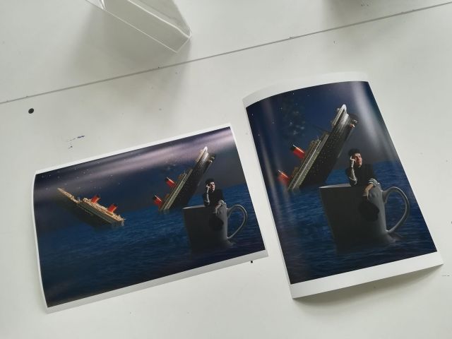
 My book arrived on Tuesday the 5th of June. When I opened the package there was instantly a problem. My book had been sent to me however the pages had been binded to a front cover for an Automative photographer called
 I’ve just received my photo-book from Mixam and I am absolutely GUTTED!!!
 Apart from that I’m very impressed with the book. I really like the images especially the double page spreads. Espeically the one where the soldiers are shaking hands, there hands meet in the bind, which I intended.

 My first idea was a spin off of Planet Of The Apes and since then I came up with some strong ideas which include:
 When I pitched the idea in the first tutorial, I myself felt like I was lost at sea with the narrative. Matt really encouraged me to push the narrative, why would Lavazza be the the rescue.
 Chris was very happy with my portraits. He said they we’re very good as standalone portraits. Matt liked the expression of the final portrait that I used.
 This project was a massive experience in being patience. This was need to be able to cut out the Titanic realistically. Not only for drawing the paths with the Pen Tool but also using the Magic Wand tool to remove the areas inside the ladders.
 I wish that I did more research into composite photography. It probably would’ve led to some more creative ideas. I don’t think I did enough research. I think I relied too much on my uncles Annie Leibovitz books to which her portrait work is very different to her composite photography for Lavazza and I didn’t really take much from her.
 Seeing on how my Lavazza comp is now officially finished. I’ve decided to do a blog post layer by layer to explain how I got to this image.
 My first port of call was to change the sky. Chris and Matt believed that this image had to be day for night.
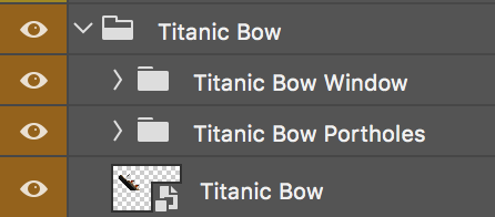 Now it’s about comping the ship into the water. This folder only has one layers, the ship. The folder also contains two sub layers which are there for light sources on the ship. These we’re created using a small
 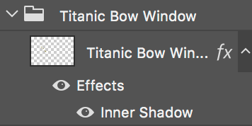 brush of yellow paint. Said layer was duplicated six times to give the bright punchy feel which adds depth to the image. [Note: Inner shadow was experimentation with blending options, make no difference to image but forgot to disable them] The folders in this group are the same in Group 3 Titanic Stern.
 Next was undoubtedly the hardest part of my comp. The reflections. This is the bit I struggled with the most. This group also involved the use of displace filters which I had to create a displace PSD file previously, thanks to a Youtube tutorial.
 The next group was the one that held both my portrait and my cup. This section was tough to get the colour temperature right. After much trial and error I finally managed the match the cup and the portrait.
 The important layers are smart objects, so I opened the PSB file and browsed through the Nix collection. To which I decided to use the Monday Morning filter on Nathan. It initially looked B&W so I put the opacity down to 39%.
 The final group of my comp is the stars which we’re painted in with a small brush of white paint. Said paint was duplicated several times and lifted to the top of the comp to become more prominent. I applied motion blur to two of the layers to give a twinkle to some of the stars. Finally I painted out a few areas where the moon glare was, so the darker stars we’re more brighter.
 Below is the final layout of my photo-story A World Beyond The War. I’ve ordered the book from Mixam. In A4 with 130 gsm silk paper.
